Responsive Design
We have learned most of what you will ever need to control the appearance and layout of HTML in the browser. Once you've mastered what we've covered in the last two chapters, you will be able to create complex yet compelling user interfaces on the web. One thing will plague you however: the web is viewed by many different types of devices, in many different form factors.
Unlike traditional applications, which will target specific types of devices - like a desktop/laptop, versus a phone or tablet - your HTML user interface needs to look "right" when users access your web page from very large screen and very small screens, screens with very high pixel density and those with low density - and pretty much everything in between!
In this section, we'll look at a few techniques to leverage CSS to allow your user interface to respond to variations in the size and pixel space available to it. We'll also discuss some common "gotchas" to avoid.
Isn't HTML already responsive?
You might be thinking... HTML already adapts pretty well to changing screen size. You are right! Some may take it for granted, but the web browser does indeed do a lot for us. Flow layout (the original layout) works pretty well on small screens - although on big screens really long strings of text is hard to read. Generally speaking, if you stick to pure HTML and don't use CSS at all you will have a web page that will look "ok" pretty much everywhere, but unfortunately it won't look great anywhere.
Responsiveness
Let's start with something that's really easy to understand: using different CSS rules for different screen sizes. The use case for this are endless, but we can start with something very fundamental - the use of horizontal screen space in text.
Here's an example of a page that contains a long article describing World War 1. It's about 2000 words, and it's being rendered on a fairly standard size laptop computer. There's no CSS.

Without margins, this is actually really difficult to read. The average person has a lot of difficulty reading long horizontal lines of characters - anything beyond 80-120 characters gets taxing, whether you consciously realize this or not. We can of course fix that. Let's put a simple wrapping div element around the text content, and set a maximum width of 600px, centered.
article {
    max-width: 600px;
    margin-inline: auto;
The result is a lot more readable.
600px was sort of arbitrary, but the point is that we've made the text content fixed width. On screens smaller than 600px, the centering and maximum text width won't come into play, and we'll use all the space available to us. In many ways, max-width is responsive. It helps us control the appearance of our elements in a way that adapts to screen size. While using max-width is nice, it's not going to fix most issues that come up with changing screen sizes - we just used it as a simple illustration of responsive design.
Responsive <meta> tags and the viewport
Before moving any further, we need to deal with a little detail tied to the history of mobile devices. 15 years ago, when mobile devices with web browsers were just starting to become something web developers needed to think about, mobile devices introduced a hack to let most websites look usable on devices with truly tiny screen sizes. For example, in 2008 the size of an iPhone's screen (width) was something around 300px. Any website that used sizing would have assumed a screen on a desktop or laptop had about 1000-1200px of width, and if the developer sized things relative to those assumptions, rendering the page on such a small devices would yield a completely unworkable layout. At the time, the iPhone (and other devices) decided to lie to the underlying CSS rendering and tell the browser the screen size was actually 960px. The phone would take the page, rendered for a 960px screen and render it such that the user needed to scroll around horizontally to access the part that flowed off the screen. This wasn't optimal, but it allowed most existing web sites remain very much usable on mobile devices.
Fast forward some years, and web developers started using the techniques we will describe below - namely, they started laying out their pages in different ways depending on what the screen width was in the first place. Developers started specifying different layouts for screens that were small (less than 960px, for example). The layouts would be optimized for those screens, making better use of small amounts of horizontal space. The problem: the phones were lying, and reporting back 960px! Without a fix, all the developer effort to creating a UI that looked good on a screen with 400px horizontally went to waste, because the phone reported to the browser that it had 960px available even though it didn't!
To resolve this, it sort of feels like we introduced another hack - and that's sort of true! To stop the browser from using an incorrect device width, we must add the following in the <head> element of our HTML pages:
<meta name="viewport" content="width=device-width,initial-scale=1" />
This element tells the device to use the true viewport width for CSS rendering. It is opt-in to allow older websites to still look reasonable (there are still MANY website that were developed before the iPhone!). All modern HTML should use the responsive opt-in though.
Using your developer tools!
Before moving forward, a word about your developer environment. One way of testing whether your HTML looks good on different sized devices is to simply work on your laptop/desktop and resize your browser window. This is a bad idea. Browsers can fool you, and while there are certainly many different devices out there, there are actually only a handful of screen sizes that you probably need to focus on. Don't do things manually, instead use your browsers's built in web developer tools.
Firefox
When viewing a web page in Firefox, you can click the details menu and choose "More tools" and then "Responsive Design Mode", or just "Web Developer Tools". Once activated, you will have a menu to choose a device for Firefox to simulate. You'll see options like "iPhone 12/13", "Galaxy S10 Android". Clicking on them will change the render to match the exact screen dimensions of the target device. No guess work!
Google Chrome (and most of it's variants) also has developer tools with very similar functionality. Apple Safari has much less support for this, and it's not recommended for web development (other than some testing specifically for Safari of course). Microsoft Edge is a variable of Google Chrome and has the same developer tools available.
Pro Tip💡 Get really comfortable with your browsers web developer tools. It's more than just responsive design. You'll be able to visualize CSS rules being applied, change CSS on the fly, and much much more. As we move to client-side JavaScript over the next few chapters, you'll use your developer tools for debugging your running JavaScript code as well. Failure to use Web Developer Tools within your browsers is an unforgivable mistake! - without them you are "flying blind"!
Media and Device queries
The most powerful tool you have for adapting your CSS to varying screen sizes and resolution is through the @media query. The @media query lets you specifying CSS for specific types of screens.
@media screen and (max-width: 600px) {
    /* CSS rules here are only applied
       if the screen size is less than
       600px
    */
}
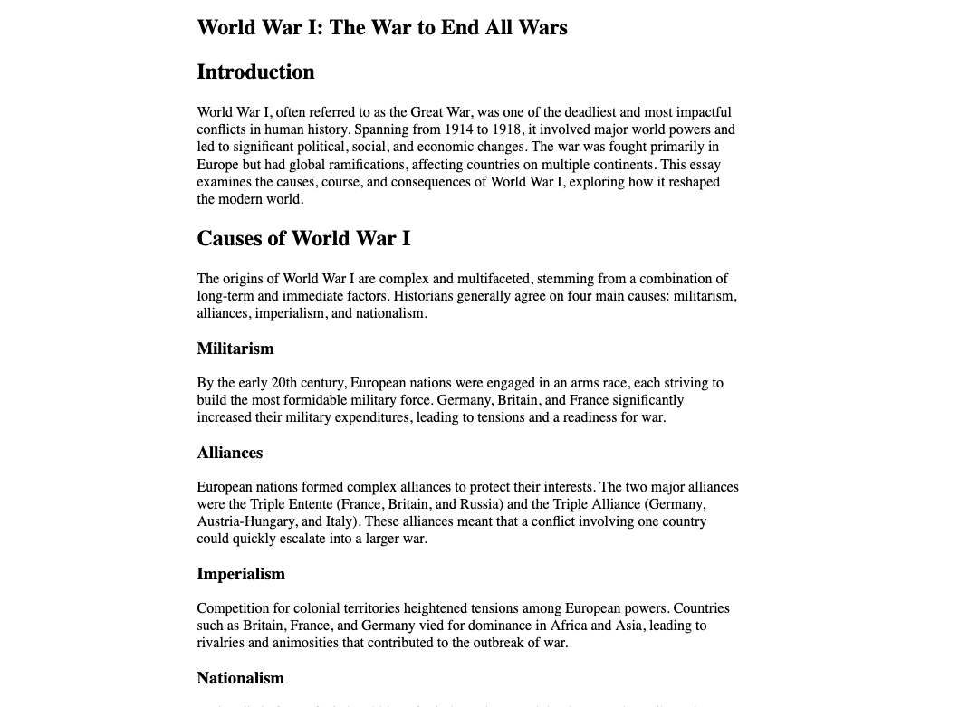
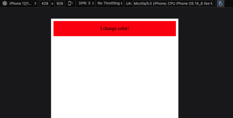
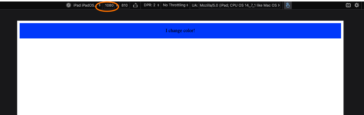
You can have any number of media queries in your CSS, and they are constantly queried whenever the window size (the viewport) changes. As a simple example, let's have the color of a div change, for small screens it will be red and for large screens it will be blue. For all screen sizes, it will have a padding of 1em with centered text.
div {
    text-align:center;
    padding:1em;
}
@media screen and (max-width: 960px) {
    div {
        background-color: red;
    }
}
@media screen and (min-width: 960px) {
    div {
        background-color:blue;
    }
}
<body>
    <div>I change color!</div>
</body>
We use the term breakpoint as a size where the rules are changing. Usually developers use 960 for mobile devices, but often they use several to support portrait oriented mobile devices, landscape orientation, tablets, and others. Your developer tools are a good source of commonly supported device widths.
Using Media Queries Effectively
Looking at the previous example, it might be hard for you to see how this helps with rendering layouts. We've learned some complex layout systems like Flex and Grid. The power of them is magnified when we see how they work with media queries.
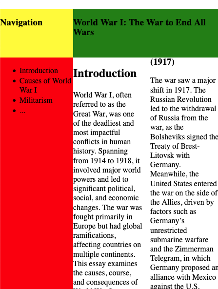
Take the following complex grid layout of an article:
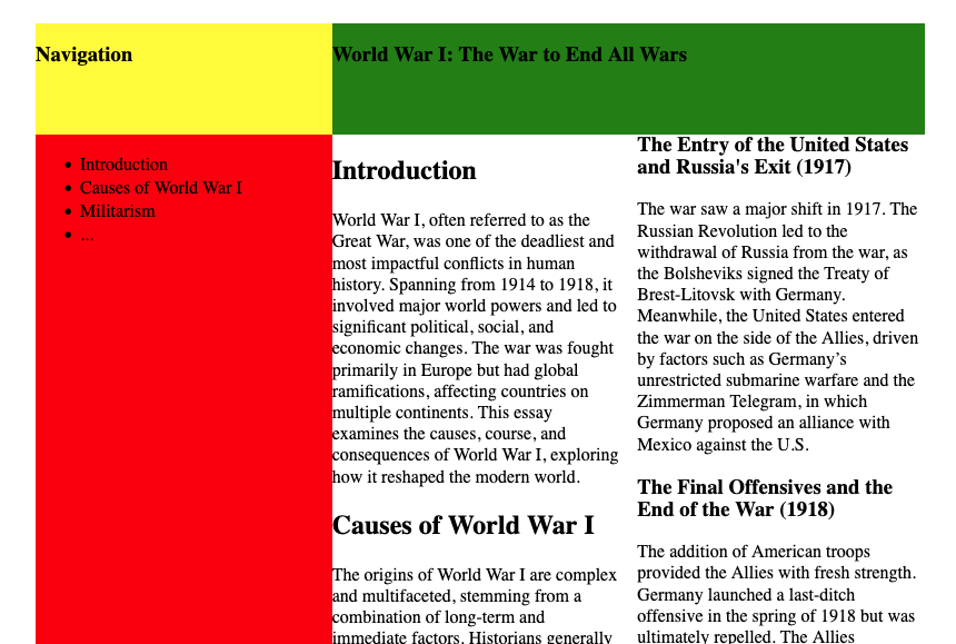
It's not pretty - but you can see the layout. There's a heading on the navigation sidebar (yellow), and a header on the main content page (green). The navigation side bar (red) would likely have links to every section. The main content (white) has text flowing in two columns to be more readable.
Here's the CSS content, and general HTML structure:
.grid-container {
    display: grid;
    grid-template-columns: repeat(3, 1fr);
    grid-template-rows: 100px auto auto;
    ;
    grid-template-areas:
        'nav-title   content-title  content-title'
        'nav-body    content-body   content-body'
        'nav-body    content-body   content-body';
}

nav.title {
    grid-area: nav-title;
    background-color: yellow;
}
nav.body {
    grid-area: nav-body;
    background-color: red;
}
article.title {
    grid-area: content-title;
    background-color: green;
}
article.body {
    grid-area: content-body;
    background-color: white;
    columns: 2;
}
<div class="grid-container">
    <nav class="title">
        <h1>Navigation</h1>
    </nav>
    <nav class="body">
        <ul>
            <li>Introduction</li>
            <li>Causes of World War I</li>
            <li>Militarism</li>
            <li>...</li>
        </ul>
    </nav>
    <article class="title">
        <h1>World War I: The War to End All Wars</h1>
    </article>
    <article class="body">
        <h2>Introduction</h2>
        <p>World War I, often referred to as the Great War, was one of the deadliest and most impactful

        ... text continues within the article element
Imagine this on a small mobile device. This isn't the right layout
We can fix this by specifying the original layout as only being applicable for larger screen sizes.
@media screen and (min-width: 960px) {
    .grid-container {
        display: grid;
        grid-template-columns: repeat(3, 1fr);
        grid-template-rows: 100px auto auto;
        ;
        grid-template-areas:
            'nav-title   content-title  content-title'
            'nav-body    content-body   content-body'
            'nav-body    content-body   content-body';
    }

    nav.title {
        grid-area: nav-title;
        background-color: yellow;
    }
    nav.body {
        grid-area: nav-body;
        background-color: red;
    }
    article.title {
        grid-area: content-title;
        background-color: green;
    }
    article.body {
        grid-area: content-body;
        columns: 2;
    }
}

We probably don't want the navigation content at all on a smaller screen, so we can refine this further by adding default CSS rules that will be in affect for small screens. These effects are then undone on larger screens.
nav {
    display: none;
}
article.title {
    /*  Can remove the color spec from the large screen spec now, it
        will apply regardless */
    background-color: green;
}
@media screen and (min-width: 960px) {
    .grid-container {
        display: grid;
        grid-template-columns: repeat(3, 1fr);
        grid-template-rows: 100px auto auto;
        ;
        grid-template-areas:
            'nav-title   content-title  content-title'
            'nav-body    content-body   content-body'
            'nav-body    content-body   content-body';
    }
    nav {
        display: block;
    }
    nav.title {
        grid-area: nav-title;
        background-color: yellow;
    }
    nav.body {
        grid-area: nav-body;
        background-color: red;
    }
    article.title {
        grid-area: content-title;
    }
    article.body {
        grid-area: content-body;
        columns: 2;
    }
}

Using media queries, we've hidden the navigation on small screens, and kept the text content columns to be 1. On larger screens, we now add the navigation back, and employ a grid layout to arrange the screen. These are two completely different layouts, with exactly the same HTML.
Mobile First
Web developers with experience will almost always recommend designing your UI for small mobile devices first. This doesn't mean small devices are most important - that's a common misconception! What this advice really is getting at is that it's usually a lot easier to adapt your design to take advantage of more space, than it is to adapt an existing design to work within less. The advice is really telling you to make sure your application looks good, and has all the necessary features on small devices first - and then build the bells and whistles that become more feasible on larger screens, using media queries.
/* Write all your basic CSS rules here... which
   will cover ALL screen sizes, and work well for
   small screens.
*/

@media screen and (min-width: 80rem) {
    /* Add all the rules you need for larger screens
       here
    */
}
If you need more than on breakpoint (the 80rem) transition, that's perfectly fine - the point is, your general CSS should target small screens, and until you get all that looking good, don't move on to bigger screens!
Flip-side of mobile first
Once you start to internalize the "mobile first" mantra, you might start to notice something... and start to realize why. A lot of web applications have really big fonts, really large spacing, and basically use screen real estate pretty poorly when you are on a laptop with a large screen and pixel density. Did you ever wonder why? It's because the developers did "mobile first" but also "mobile, and that's it". The UI was created so it worked well on mobile small screens, and then a decision was make not to invest in making better use of screen space when more was available.
We can debate whether that's a good decision or not. Often times, that decision is made because there simply aren't that many users working on large screens for the particular app, and there are more important priorities to dedicate time to. It's not necessary a good thing, but it might give you some insight into why things look they way the do on the modern web!