Box Model and Flow Layout
The last chapter focused on applying CSS to elements using selectors, and by taking advantages of, and working with, the CSS rule cascade. We looked at how to style text, and a variety of other elements. In this chapter, we start thinking about perhaps the most impactful role CSS plays - where elements land on the screen!
Box Model
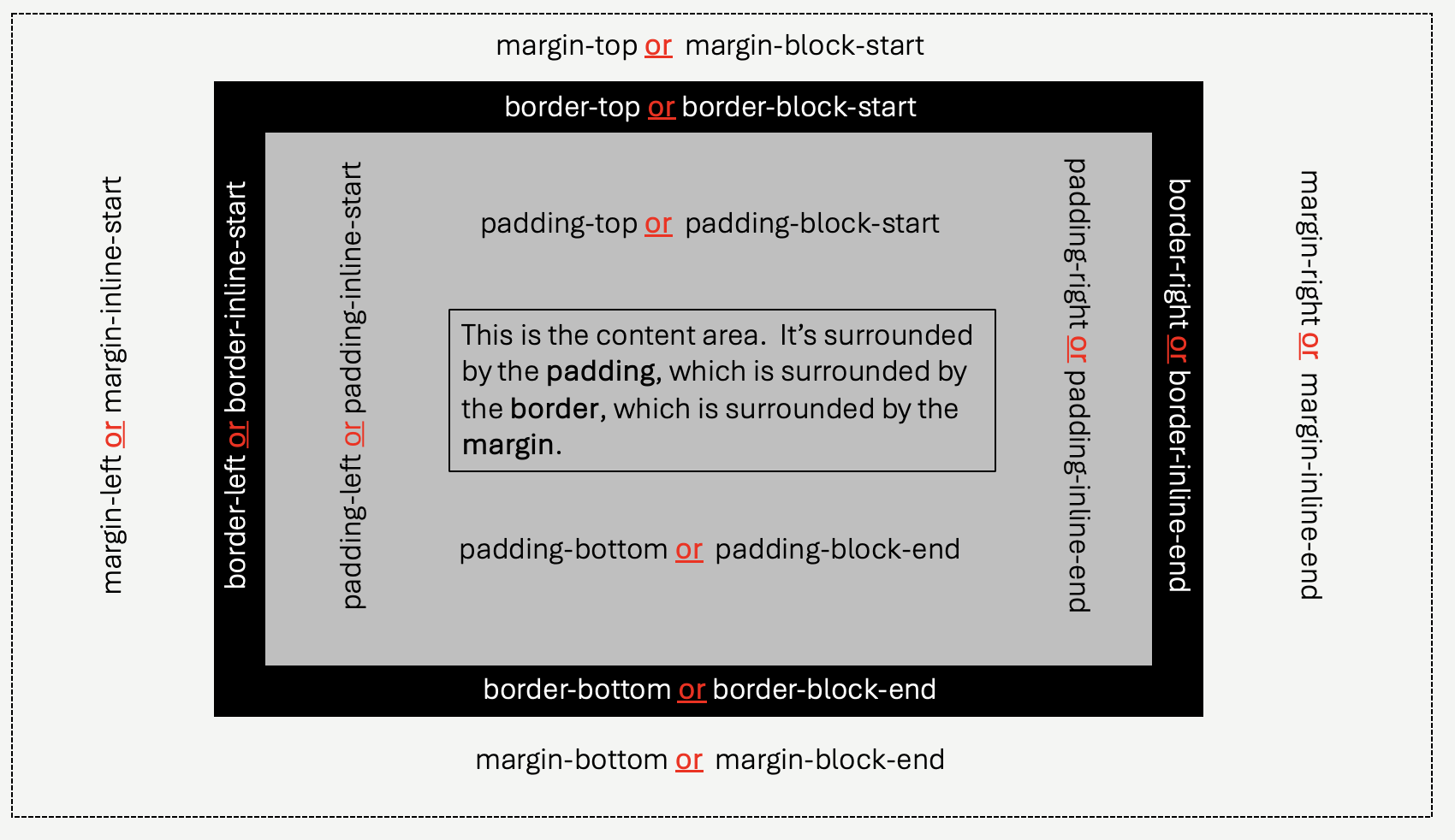
CSS supports many methods of arranging elements on the screen (the window, or viewport) - but before we look at those, we need to understand the way CSS treats the elements themselves. All elements rendered by the web browsers have fundamentally the same structure - content, padding, border, and margin. Learning to control each of these is the first and most important step in controlling the layout of your page.
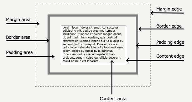
- content: An elements content region is controlled by the content within it. This means the natural size of text and other elements within it. The term natural is a loaded word here, because of course CSS will govern the size of the elements within the content as well - it's a recursive concept! Pure text elements will have height and width dictated by the font size (and font shape), along with line height, and some of the other text controls we saw previously. The most important point to keep in mind that when styling an element, you don't need directly control the content dimensions, although you can.
- padding: Every element has padding, which creates spacing between the content itself, and a border.
- border: Every element has a border, it's just that the default border is transparent, and zero pixels wide. That might sound pedantic, but it's important. Borders separate two "whitespace" regions - padding and margin. The two regions behave differently, so it's critical that the separation is always clear to you. Of course, borders may have thickness, usually specifying in pixels. Borders can also have color, and styles (ie. dashed, etc).
- margin: Every element has margin, which creates spacing between the element's border and the border of any adjacent element. Margin is not truly considered part of the element, it's spacing around the element. This is in contrast to padding, which is interior spacing and very much belongs to the element.
For a moment, let's delay our discussion on content dimensions, and focus on controlling the padding, border, and margin of an element. We'll come back to the content dimensions when we begin to deal with layout itself.
Borders are the anchor to the box model - even though for most elements they are invisible. Let's start there, and work our way in, and then out.
Borders
Borders can have the following properties:
- width - and valid CSS length. Pixels are the most common here, but you may use other specifications. Note, whether we are talking about borders along the top, bottom, left, or right side of an element, we always call the "thickness" the width.
- color - the color of the border itself, which will only be visible when there is a non-zero border width (and the style is not hidden)
- style - the visual appearance of the border. It may be
hidden, meaning it is transparent. When borders have a width, but are set tohidden, they occupy space, but are not seen. Visual styles includedotted,dashed,solid,double,groove, and others.solidis by far the most common. W3Schools has an interactive tool that allows you to experiment with various values.
Setting with width, color, and style are all accomplished by specifying which part of the border to alter. You can (1) specify all four sides, (2) just the top and bottom (referred to as "block") using -block, just the (3) left and right (referred to as "inline") using -inline, and (4) one side individually using -top, -bottom, -left or right.
For example:
        div {
            border-width:5px;
            border-color:red;
            border-style:dotted;
        }
        div {
            border-block-width:5px;
            border-block-color:red;
            border-block-style:dotted;
        }
        div {
            border-right-width:5px;
            border-right-color:red;
            border-right-style:dotted;
        }
You can also mix and match, and override properties already set. In this example, we specify the properties of all 4 sides, and then override the style of the inline sides, and the width of the top side.
        div {
            border-style: dotted;
            border-width:3px;
            border-inline-style:solid;
            border-top-width:10px;
        }
There are shortcut specifiers as well - however most developers try to avoid them. They can lead to less readable code, and sometimes make bugs harder to find. That said - since all three properties accept different types of data, you can specify an number of them all at once, by omitting the property name in the rule.
        div {
            /* white color, dotted style, default width */
            border: white dotted;
        }
        div {
            /* white color, dotted style, default width */
            border: white dotted;
            /* white color, dotted style, default width */
            border-right: 20px solid;
        }
Padding
Padding is controlled using a similar approach as borders, although there are fewer properties. Padding is always transparent - their background color is always the same as the content - or the element itself. As such, if you want padding to be red, you set the background color of the element to red. In fact, the only property you can control for padding is width.
We can control padding width by specifying padding, padding-block, padding-inline, padding-top, padding-bottom, padding-left, and padding-right. Padding is always specified withe a CSS.
div {
    border: white solid;
    background-color:navy;
    padding: 0px;
    width:300px;
}
div has a border, a background color, and it's padding (on all sides) has been set to zero. In order to get the full effect, it's width is also constrained to 300px, so we get word wrapping and such. We'll cover width soon. Notice that their is no spacing between the characters of text and the border itself on the left hand side - the first characters start literally on the next pixel after the border's edge. There is a small amount of space on the top and bottom, but this is because the *line box* for the font being used has some extra space. Recall from the last chapter, line boxes govern text rendering - and to avoid these handful of pixels at the top and bottom, we'd need to change the actual line-height. The space on the right varies, only because the web browsers is doing automatic word wrapping, and leaving some unused space. If we used text-align:justify you'd see this go away to a large extent.
Now let's take a look at changing the padding - adding a 2rem padding at the top and bottom, and a 10rem padding on the right side:
div {
    border: white solid;
    background-color:navy;
    padding: 0px;
    width:300px;

    padding-block:2rem;
    padding-right:10rem;
}
div has a border, a background color, and it's padding (on all sides) has been set to zero. In order to get the full effect, it's width is also constrained so we get word wrapping and such. Here there is a ton of space on the right, because of the 10rem padding applied. There's a more modest amount of padding on the top and bottom. Padding is frequently specified relative to the base font size, since that is usually adjusted based on screen density.
Box Sizing, and Padding
The figure above shows an extremely important aspect of padding, and how it interacts with width. The width property controls an element's content width. Referring to the first figure in this chapter, the content area is distinct from padding - padding is the space between the content area and the border. Note how the width:300px appears in the previous two figures. The text is occupying 300px of screen space, but the distance between the left and right border changes, based on the padding. The width property does not include padding (or border, or margin!).
In the 1990's, there wasn't agreement on this actually. Microsoft Internet Explorer included padding and borders in the calculation of an elements width, while all the other browsers did not. Internet Explorer was "wrong", in that it was not following the CSS specification - however it was "right", in that most developers actually found it's method to be a bit more intuitive. Regardless of who was right or wrong, having different browsers supporting different modes of width calculation was a disaster, and by Internet Explorer 6.0 the browser adopted the CSS specification when running in standards mode.
All was good, but developers still often preferred to include padding and border in width calculations. This was especially helpful when needing to precisely control width of elements, like when building animations, games, etc. The release of CSS 3.0 came with a solution - the box-sizing property. The default for all elements is to have box-sizing: content-box. This uses only the content when calculating the width parameter (and height). There is a second option however, which includes padding and border - box-sizing: border-box.
div {
    border: white solid;
    background-color:navy;
    padding: 0px;
    width:300px;

    padding-block:2rem;
    padding-right:10rem;
}
div has a width of 200px, with box-sizing set to content-box. It has a large amount of padding on the right side. As you can see, the text itself is taking up about 200 pixels of screen size.
div {
    border: white solid;
    background-color:navy;
    padding: 0px;
    width:300px;

    padding-block:2rem;
    padding-right:10rem;
    box-sizing:border-box;
}
div has it's box-sizing set to border-box. Given all the padding, and the small width, it's ugly - but the visible "box" is now exactly 300px, making it a lot easier to control.
Padding and Inline Elements
One additional note about padding - and this will apply to margins too - they apply selectively to inline elements. We are going to talk a lot more about inline and block elements in this chapter, but we discussed their differences when we introduced HTML itself towards the beginning of this book. HTML block elements occupy their own vertical space - there aren't any element to their left and right. For block elements, padding can be applied to the top and bottom of the element, along with the right and left. Inline elements, however - do not occupy their own vertical space. They are part of line boxes, and are line wrapped by the browser. Inline elements do not support padding-block, padding-top, or padding-bottom because they do not control their vertical positioning.
Here's an example.
div has a padding of 10px, with a navy blue background. In this example, the text starting here, and continuing until here is wrapped in a span
element. The span set's padding values on all 4 sides of 10em, and a color of `yellow`. You should be able
to tell, the top and bottom padding are not honored by the browser.
Margin
Margins are similar to padding, in that they have no color, and they have no style. They are, by definition, empty space. The margin is a CSS length that establishes the minimum separation of an element's border from any adjacent element's border. The color of the margin is controlled by the parent element's background color - since the margin itself is transparent. Margin space does not "belong" to the element you set it on, nor does it belong to the adjacent elements - it's space that technically speaking is owned by the parent (containing) element. Margin never counts towards an element's height or width, so box-sizing is not relevant.
Just like border and padding, we can specify margin using just margin, or by using the -block, -inline, -top, -bottom, -right or -left.
To visualize the spacing, let's look at three block elements with zero margin on the top and bottom:
margin-block:0px
Now let's add some margins, to the middle element.
margin-block:2rem, and because of that, it's border no longer touches it's neighbors. The distance between the borders on the top and bottom are 2rem. Notice that the background color of the element does not extend into the margin. The color of the space between the borders is transparent, it's just the color of the containing element, which in this case is just the page.
Margin Collapse
An interesting things about margins is that they are defined very precisely: a 10px margin means no other element's border can be within 10px of this element's margin. Let's take the previous example, and make all three blocks have a 2rem block margin:
4rem, since the elements on either side have 2rem, but that is NOT how CSS works. Neighboring margins collapse, they overlap.
When adjacent margins are not equal, then the distance between the elements will be the larger of the two:
Left, Right, Inline-Start, Inline-End...
If you consult the CSS specification, you'll notice that in addition to padding-left, there's also padding-inline-start. The counterpart to right is -inline-end. Likewise, in addition to padding-top, there's also padding-block-start that accomplishes the same thing. The same goes for border-* and margin-*. What's this all about?
The trend in web development standards is to move towards "start" and "end" rather than using two different pairs for the vertical and horizontal axis. It's more orthogonal, and people (developers) tend to like that.
The modern approach:
- left and right, refers to the inline (horizontal) axis. The inline axis, in most natural languages starts from the left and ends on the right.
- up and down, refers to the block (vertical) axis. The block axis, in most natural languages starts at the top, and ends on the bottom.
Modern CSS is moving towards always saying "start" and "end", for either axis - instead of using different terminology (top/bottom or left/right). There are two benefits:
- It's better for parameterization (I guess). You can imagine parameterizing a function with two independent variables - the axis (inline or block) and the side (start or end). You can specify any combination, and have a valid side. This is indeed helpful in many cases, albeit we've been writing code to deal with
top bottom left rightfor a long time too :) - The bigger advantage - your terminology is no longer tied to real physical directions, which allows your code to remain unchanged when the most in most natural languages doesn't hold. There are languages that read right to left. Their are documents that flow bottom to top. If you are dealing with those situations, rather than constantly mentally flipping left/right and top/bottom, your terminology remains consistent.
In fact, you can change an element's text flow, using the direction:ltr or direction:rtl CSS rules. Setting this on individual elements is discouraged, instead it's recommended to use the dir global attribute on the HTML page itself.
The paragraph below (highlighted in yellow for some clarity) is really odd, because it is set to read right to left. The period at the end of the sentence is actually moved to the left side - because the browser expects the . at the end, and the end is on the left side! It would make much more sense if the text was written in a language like Hebrew or Arabic, which do, genuinely read right to left!
This paragraph incorrectly goes right to left because it's dir attribute is set to rtl.
The reason this is important to this discussion though, is that once the dir is set to rtl, border-line-start will correctly refer to the right hand side!
p {
    background-color:yellow;
    color:black;
    border-inline-start: red solid 10px;
}
This has a red, solid, 10px wide border at border-inline-start. It appears on the right side, because the element has the HTML attribute `dir=rtl` set on it.
This has a red, solid, 10px wide border at border-inline-start. It appears on the left side, because the element has not been specified as reading right to left, and instead is the default, left to right. Both of these use the SAME CSS rules.
If you are unconvinced, it's forgivable - but if you plan on creating web applications to support an international audience (this is the world wide web, after all), it's definitely in your best interests to pay attention to these new methods!
Border Goodies
If there are two visual effects that consumed an untold amount of time, money, and CPU cycles to create in the 1990's-2010's it's rounded corners and shadows. Today, these things are really pretty easy (although shadows can be complex to specify given all the options).
.rounded_and_shadow {
    color: brown.
    background-color:tan;
    border-width: 10px;
    border-color: brown;
    border-style: solid;
    border-radius:5px;
    box-shadow: 10px 10px grey;
}
This is a block with rounded corners and a drop shadow, it uses the .rounded_and_shadow class from above. Of course, you can use border-radius and box-shadow independently, the need no go together.
Until these were added to CSS in CSS 3.0, developers needed to use various complicated, brittle, and expensive techniques to simulated these effects. This includes creating rounded corner *images*, and placing them right along side elements, essentially creating borders out of images instead of the borders supplied by CSS itself! Shadows were even more tricky. Suffice to say, you are very lucky you don't need to think about using table elements for things that table elements were most certainly never intended to be used for!
Of course, now that they are easy, they also aren't as cool anymore. 😎
You are encouraged to read the MDN docs on both box-shadow and border-radius. When used subtly, they create visually appealing effects.
Summary
The box model, and it's associated properties are a fundamental concept for everything that comes next. The box model is your roadmap for defining the sizing of the three primary structural aspects of each element. Those three - padding border and margin when combined with content provides you full control over the screen real estate each HTML element on your page is entitled to.