Bootstrap
There are hundreds of CSS frameworks to choose from, but in many respects there is one that really started it all - and that's Bootstrap. Bootstrap is perhaps the most ubiquitous and widely used CSS framework. While modern CSS makes a lot of what Bootstrap does somewhat redundant, it's maturity and robustness as a CSS framework still makes it a solid choice when starting a new application. In this section, we'll cover just some of the simple basics - there is a lot more material online to review yourself.
Some background
Bootstrap was originally created by Mark Otto and Jacob Thornton at Twitter as a framework to encourage consistency across internal tools. It was released as an open-source project on August 19, 2011. The framework quickly gained popularity due to its responsive design capabilities and ease of use.
The initial release, Bootstrap 2, introduced the 12-column grid system and responsive design features, which allowed developers to create fluid layouts that adapted to different screen sizes. This was a significant advancement at the time, as mobile web usage was rapidly increasing.
Bootstrap 3, released in August 2013, further improved the framework by adopting a mobile-first approach. This version emphasized responsive design from the start, making it easier for developers to create mobile-friendly websites. It also introduced a new flat design aesthetic, which was in line with contemporary design trends.
In 2018, Bootstrap 4 was released, bringing major changes such as a switch to Sass for CSS preprocessing, improved grid system, and enhanced utility classes. This version also dropped support for Internet Explorer 8 and 9, allowing the framework to leverage more modern web technologies.
The latest version, Bootstrap 5, was released in May 2021. It removed dependency on jQuery, introduced new components, and improved customization options. Bootstrap continues to be one of the most widely used CSS frameworks, powering millions of websites worldwide.
Integrating Bootstrap into a Web Application
Integrating Bootstrap into your web application is straightforward. You can include Bootstrap via a Content Delivery Network (CDN) or by downloading the Bootstrap files and hosting them locally.
Using CDN
The easiest way to integrate Bootstrap is by using the CDN links. This method ensures that you always use the latest version of Bootstrap and reduces the load on your server.
Include the following lines in the <head> section of your HTML file to add Bootstrap CSS and JavaScript:
<!DOCTYPE html>
<html lang="en">
<head>
    <meta charset="UTF-8">
    <meta name="viewport" content="width=device-width, initial-scale=1.0">
    <title>Bootstrap Integration</title>
    <!-- Bootstrap CSS -->
    <link href="https://cdn.jsdelivr.net/npm/[email protected]/dist/css/bootstrap.min.css" rel="stylesheet" integrity="sha384-QWTKZyjpPEjISv5WaRU9OFeRpok6YctnYmDr5pNlyT2bRjXh0JMhjY6hW+ALEwIH" crossorigin="anonymous">
</head>
<body>
    <!-- All the HTML for your page goes here... -->

    <script src="https://cdn.jsdelivr.net/npm/[email protected]/dist/js/bootstrap.bundle.min.js" integrity="sha384-YvpcrYf0tY3lHB60NNkmXc5s9fDVZLESaAA55NDzOxhy9GkcIdslK1eN7N6jIeHz" crossorigin="anonymous"></script>
</body>
</html>
Hosting Bootstrap Locally
If you prefer to host Bootstrap files locally, you can download the Bootstrap CSS and JavaScript files from the Bootstrap website. After downloading, include the files in your project directory and reference them in your HTML file.
-
Download the Bootstrap files and place them in your project directory (e.g.,
cssandjsfolders). -
Include the following lines in the
<head>section of your HTML file to add Bootstrap CSS and JavaScript:
<!DOCTYPE html>
<html lang="en">
<head>
    <meta charset="UTF-8">
    <meta name="viewport" content="width=device-width, initial-scale=1.0">
    <title>Bootstrap Integration</title>
    <!-- Bootstrap CSS -->
    <link href="css/bootstrap.min.css" rel="stylesheet">
</head>
<body>
    <!-- Your content here -->

    <!-- Bootstrap Bundle with Popper -->
    <script src="js/bootstrap.bundle.min.js"></script>
</body>
</html>
Bootstrap's Grid System
Bootstrap's grid system is a powerful and flexible layout system that allows developers to create complex, responsive layouts with ease. It is based on a 12-column layout and uses a series of containers, rows, and columns to structure content. The grid system in Bootstrap 5 is built with flexbox, which provides more control over alignment and spacing.
Pro Tip💡 Bootstraps grid system predates CSS Grid layout from the previous chapter, and really is fundamentally different. In Bootstrap, elements are assigned classes - rows and columns, and those elements are arranged in a grid. With CSS Grid, the container defines the grid, and elements are pinned to grid lines. Both approaches can be used for most design objectives - but they are not the same! CSS Grid is in many ways a more flexible and powerful approach, but for many, the grid system Bootstrap uses is more straightforward and easier to get started with.
How to Use the Grid System
-
Containers: Containers are the most basic layout element in Bootstrap and are required when using the grid system. They provide a means to center and horizontally pad your site's contents. There are two types of containers:
.container: A responsive fixed-width container..container-fluid: A full-width container that spans the entire width of the viewport.
<div class="container"> <!-- Content here --> </div> <div class="container-fluid"> <!-- Content here --> </div> -
Rows: Rows are used to create horizontal groups of columns. They must be placed within a container.
<div class="container"> <div class="row"> <!-- Columns go here --> </div> </div> -
Columns: Columns are the building blocks of the grid system. They are used to create the actual layout. Columns are specified using classes like
.col,.col-4,.col-md-6, etc. The number after thecol-indicates how many columns the element should span.<div class="container"> <div class="row"> <div class="col">Column 1</div> <div class="col">Column 2</div> <div class="col">Column 3</div> </div> </div>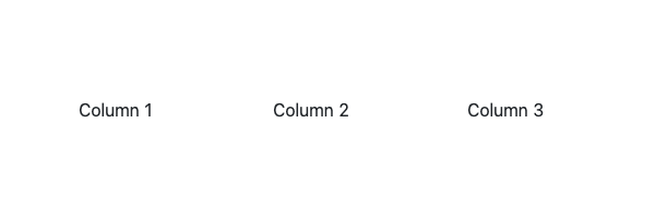
In the example above, each column will take up an equal amount of space. You can also specify the number of columns each element should span:
<div class="container">
  <div class="row">
     <div class="col-4" style="border: thin solid black">Column 1</div>
     <div class="col-8" style="border: thin solid black">Column 2</div>
  </div>
</div>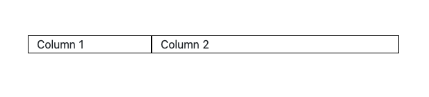
-
Responsive Columns: Bootstrap's grid system is responsive, meaning the columns will automatically adjust based on the screen size. You can specify different column sizes for different screen sizes using classes like
.col-sm-,.col-md-,.col-lg-, and.col-xl-.<div class="container"> <div class="row"> <div class="col-sm-6 col-md-4 col-lg-3">Responsive Column</div> <div class="col-sm-6 col-md-4 col-lg-3">Responsive Column</div> <div class="col-sm-6 col-md-4 col-lg-3">Responsive Column</div> <div class="col-sm-6 col-md-4 col-lg-3">Responsive Column</div> </div> </div>
By using containers, rows, and columns, you can create a wide variety of responsive layouts with Bootstrap's grid system. The flexibility and ease of use make it a popular choice for developers looking to build modern, responsive websites.
Responsiveness in Bootstrap
Responsiveness is a key feature of Bootstrap, allowing developers to create layouts that adapt to different screen sizes and devices. Bootstrap defines several breakpoints that correspond to common device sizes, making it easier to design responsive websites.
Breakpoints
Bootstrap's breakpoints are based on minimum viewport widths, meaning they apply to that breakpoint and all larger viewports. The breakpoints are:
- Extra small (xs):
<576px - Small (sm):
≥576px - Medium (md):
≥768px - Large (lg):
≥992px - Extra large (xl):
≥1200px - XXL (xxl):
≥1400px
These breakpoints can be used to apply different styles at different screen sizes. For example, you can create a layout that changes based on the viewport width.
Display Utilities
Bootstrap provides a set of display utility classes that can be used to control the display property of elements. These classes can be combined with responsive modifiers to apply styles at specific breakpoints.
.d-none: Hides an element..d-block: Displays an element as a block..d-inline: Displays an element as an inline element..d-inline-block: Displays an element as an inline-block..d-flex: Displays an element as a flex container..d-grid: Displays an element as a grid container.
You can use these classes with responsive modifiers to apply styles at specific breakpoints. For example:
<div class="d-none d-sm-block">Visible on small and larger screens</div>
<div class="d-block d-md-none">Visible on extra small and small screens</div>
<div class="d-flex d-lg-none">Flex container on all screens except large and larger</div>
<div class="d-grid d-xl-block">Grid container on all screens except extra large and larger</div>
Responsive Modifiers
Responsive modifiers can be used with various utility classes to apply styles at specific breakpoints. Some common utility classes that can be used with responsive modifiers include:
- Margin and Padding:
.m-,.p-,.mt-,.mb-,.ml-,.mr-,.mx-,.my- - Text Alignment:
.text-start,.text-center,.text-end - Float:
.float-start,.float-end,.float-none
For example, you can apply different margins at different breakpoints:
<div class="m-3 m-md-5 m-lg-7">Responsive Margins</div>
By using Bootstrap's breakpoints and responsive utility classes, you can create layouts that adapt to different screen sizes and devices, ensuring a consistent and user-friendly experience across all platforms.
Bootstrap Components
Bootstrap provides a wide range of reusable components that can be used to build responsive and interactive user interfaces. Some of the most commonly used components include navs, list groups, and dialogs.
Navs
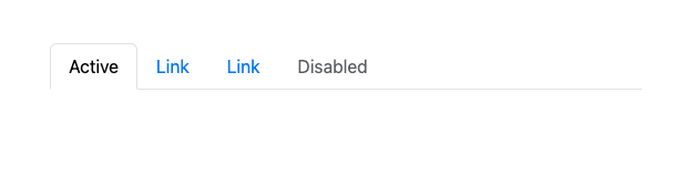
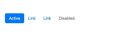
Navs are a flexible and versatile component for creating navigation menus. Bootstrap provides several classes to create different types of navs, including tabs, pills, and vertical navs.
Tabs:
<ul class="nav nav-tabs">
    <li class="nav-item">
        <a class="nav-link active" href="#">Active</a>
    </li>
    <li class="nav-item">
        <a class="nav-link" href="#">Link</a>
    </li>
    <li class="nav-item">
        <a class="nav-link" href="#">Link</a>
    </li>
    <li class="nav-item">
        <a class="nav-link disabled" href="#" tabindex="-1" aria-disabled="true">Disabled</a>
    </li>
</ul>
Pills:
<ul class="nav nav-pills">
    <li class="nav-item">
        <a class="nav-link active" href="#">Active</a>
    </li>
    <li class="nav-item">
        <a class="nav-link" href="#">Link</a>
    </li>
    <li class="nav-item">
        <a class="nav-link" href="#">Link</a>
    </li>
    <li class="nav-item">
        <a class="nav-link disabled" href="#" tabindex="-1" aria-disabled="true">Disabled</a>
    </li>
</ul>
List Groups
List groups are a flexible and powerful component for displaying a series of content. They can be used for navigation, displaying lists of items, and more.
Basic List Group:
<ul class="list-group">
    <li class="list-group-item">Cras justo odio</li>
    <li class="list-group-item">Dapibus ac facilisis in</li>
    <li class="list-group-item">Morbi leo risus</li>
    <li class="list-group-item">Porta ac consectetur ac</li>
    <li class="list-group-item">Vestibulum at eros</li>
</ul>
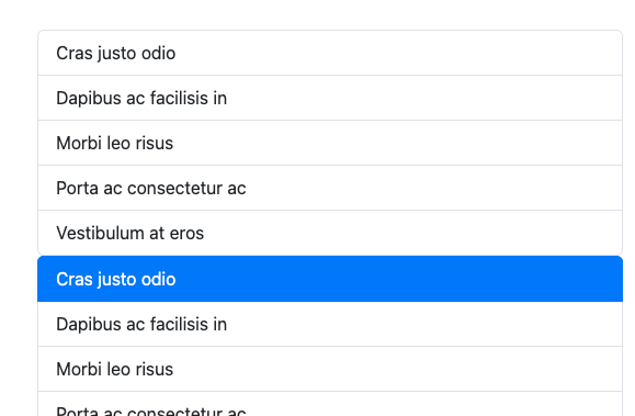
List Group with Links:
<div class="list-group">
    <a href="#" class="list-group-item list-group-item-action active">Cras justo odio</a>
    <a href="#" class="list-group-item list-group-item-action">Dapibus ac facilisis in</a>
    <a href="#" class="list-group-item list-group-item-action">Morbi leo risus</a>
    <a href="#" class="list-group-item list-group-item-action">Porta ac consectetur ac</a>
    <a href="#" class="list-group-item list-group-item-action disabled" tabindex="-1" aria-disabled="true">Vestibulum at eros</a>
</div>
Dialogs
Dialogs, also known as modals, are a powerful component for displaying content in a layer above the main content. They can be used for alerts, confirmations, forms, and more.
Basic Modal:
<!-- Button trigger modal -->
<button type="button" class="btn btn-primary" data-bs-toggle="modal" data-bs-target="#exampleModal">
    Launch demo modal
</button>

<!-- Modal -->
<div class="modal fade" id="exampleModal" tabindex="-1" aria-labelledby="exampleModalLabel" aria-hidden="true">
    <div class="modal-dialog">
        <div class="modal-content">
            <div class="modal-header">
                <h5 class="modal-title" id="exampleModalLabel">Modal title</h5>
                <button type="button" class="btn-close" data-bs-dismiss="modal" aria-label="Close"></button>
            </div>
            <div class="modal-body">
                ...
            </div>
            <div class="modal-footer">
                <button type="button" class="btn btn-secondary" data-bs-dismiss="modal">Close</button>
                <button type="button" class="btn btn-primary">Save changes</button>
            </div>
        </div>
    </div>
</div>
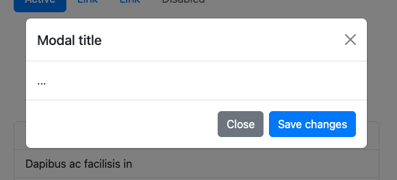
Explanation:
- data-bs-toggle="modal": This attribute is used to toggle the modal. When the button is clicked, it will trigger the modal to open.
- data-bs-target="#exampleModal": This attribute specifies which modal to open. The value should match the
idof the modal you want to display. - modal: This class is used to define the modal component.
- fade: This class adds a fading effect when the modal is shown or hidden.
- id="exampleModal": This is the unique identifier for the modal. It is referenced by the
data-bs-targetattribute on the button. - tabindex="-1": This attribute is used to remove the modal from the natural tab order, preventing users from tabbing to it when it is not open.
- aria-labelledby="exampleModalLabel": This attribute associates the modal with a label, improving accessibility by providing a descriptive label for screen readers.
- aria-hidden="true": This attribute indicates that the modal is hidden from screen readers when it is not displayed.
By using these components, you can create rich and interactive user interfaces with Bootstrap. Each component is highly customizable and can be easily integrated into your web application.
Color, Text, and Spacing Controls
Bootstrap provides a variety of utility classes to control the color, text, and spacing of elements. These classes make it easy to apply consistent styling across your web application.
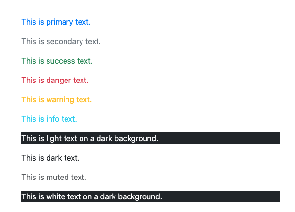
Text Color
Bootstrap includes several predefined classes for setting the text color of elements. These classes are based on the theme colors and can be used to quickly change the color of text.
.text-primary: Applies the primary color to the text..text-secondary: Applies the secondary color to the text..text-success: Applies the success color to the text..text-danger: Applies the danger color to the text..text-warning: Applies the warning color to the text..text-info: Applies the info color to the text..text-light: Applies the light color to the text..text-dark: Applies the dark color to the text..text-muted: Applies a muted color to the text..text-white: Applies the white color to the text.
Example:
<p class="text-primary">This is primary text.</p>
<p class="text-secondary">This is secondary text.</p>
<p class="text-success">This is success text.</p>
<p class="text-danger">This is danger text.</p>
<p class="text-warning">This is warning text.</p>
<p class="text-info">This is info text.</p>
<p class="text-light bg-dark">This is light text on a dark background.</p>
<p class="text-dark">This is dark text.</p>
<p class="text-muted">This is muted text.</p>
<p class="text-white bg-dark">This is white text on a dark background.</p>
Margin and Padding
Bootstrap provides utility classes to control the margin and padding of elements. These classes follow a consistent naming convention and can be used to apply spacing in various directions.
- Margin Classes:
.m-,.mt-,.mb-,.ml-,.mr-,.mx-,.my- - Padding Classes:
.p-,.pt-,.pb-,.pl-,.pr-,.px-,.py-
The classes use a scale from 0 to 5 to specify the amount of spacing:
0:0spacing1:$spacer * .252:$spacer * .53:$spacer4:$spacer * 1.55:$spacer * 3
Example:
<div class="m-3">Margin on all sides</div>
<div class="mt-3">Margin on top</div>
<div class="mb-3">Margin on bottom</div>
<div class="ml-3">Margin on left</div>
<div class="mr-3">Margin on right</div>
<div class="mx-3">Margin on left and right</div>
<div class="my-3">Margin on top and bottom</div>

<div class="p-3">Padding on all sides</div>
<div class="pt-3">Padding on top</div>
<div class="pb-3">Padding on bottom</div>
<div class="pl-3">Padding on left</div>
<div class="pr-3">Padding on right</div>
<div class="px-3">Padding on left and right</div>
<div class="py-3">Padding on top and bottom</div>
By using these utility classes, you can easily control the color, text, and spacing of elements in your Bootstrap-based web application, ensuring a consistent and visually appealing design.
Buttons and Form Controls
Bootstrap provides a wide range of buttons and form controls that can be used to create interactive and user-friendly forms. These components are highly customizable and can be easily integrated into your web application.
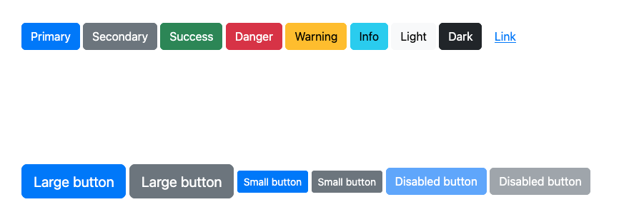
Buttons
Bootstrap includes several predefined button styles, each serving its own semantic purpose. You can use these classes to create buttons with different colors, sizes, and states.
Basic Buttons:
<button type="button" class="btn btn-primary">Primary</button>
<button type="button" class="btn btn-secondary">Secondary</button>
<button type="button" class="btn btn-success">Success</button>
<button type="button" class="btn btn-danger">Danger</button>
<button type="button" class="btn btn-warning">Warning</button>
<button type="button" class="btn btn-info">Info</button>
<button type="button" class="btn btn-light">Light</button>
<button type="button" class="btn btn-dark">Dark</button>
<button type="button" class="btn btn-link">Link</button>
Button Sizes:
<button type="button" class="btn btn-primary btn-lg">Large button</button>
<button type="button" class="btn btn-secondary btn-lg">Large button</button>
<button type="button" class="btn btn-primary btn-sm">Small button</button>
<button type="button" class="btn btn-secondary btn-sm">Small button</button>
Button States:
<button type="button" class="btn btn-primary" disabled>Disabled button</button>
<button type="button" class="btn btn-secondary" disabled>Disabled button</button>
Form Controls
Bootstrap provides a variety of form controls that can be used to create interactive forms. These controls include text inputs, checkboxes, radio buttons, select dropdowns, and more.
Text Inputs:
<div class="mb-3">
    <label for="exampleInputText" class="form-label">Text Input</label>
    <input type="text" class="form-control" id="exampleInputText" placeholder="Enter text">
</div>
Checkboxes:
<div class="form-check">
    <input class="form-check-input" type="checkbox" value="" id="flexCheckDefault">
    <label class="form-check-label" for="flexCheckDefault">
        Default checkbox
    </label>
</div>
<div class="form-check">
    <input class="form-check-input" type="checkbox" value="" id="flexCheckChecked" checked>
    <label class="form-check-label" for="flexCheckChecked">
        Checked checkbox
    </label>
</div>
Radio Buttons:
<div class="form-check">
    <input class="form-check-input" type="radio" name="flexRadioDefault" id="flexRadioDefault1">
    <label class="form-check-label" for="flexRadioDefault1">
        Default radio
    </label>
</div>
<div class="form-check">
    <input class="form-check-input" type="radio" name="flexRadioDefault" id="flexRadioDefault2" checked>
    <label class="form-check-label" for="flexRadioDefault2">
        Checked radio
    </label>
</div>
Select Dropdowns:
<div class="mb-3">
    <label for="exampleSelect" class="form-label">Select Dropdown</label>
    <select class="form-select" id="exampleSelect">
        <option selected>Open this select menu</option>
        <option value="1">One</option>
        <option value="2">Two</option>
        <option value="3">Three</option>
    </select>
</div>
Textareas:
<div class="mb-3">
    <label for="exampleTextarea" class="form-label">Textarea</label>
    <textarea class="form-control" id="exampleTextarea" rows="3"></textarea>
</div>
Input Groups:
<div class="input-group mb-3">
    <span class="input-group-text" id="basic-addon1">@</span>
    <input type="text" class="form-control" placeholder="Username" aria-label="Username" aria-describedby="basic-addon1">
</div>
<div class="input-group mb-3">
    <input type="text" class="form-control" placeholder="Recipient's username" aria-label="Recipient's username" aria-describedby="basic-addon2">
    <span class="input-group-text" id="basic-addon2">@example.com</span>
</div>
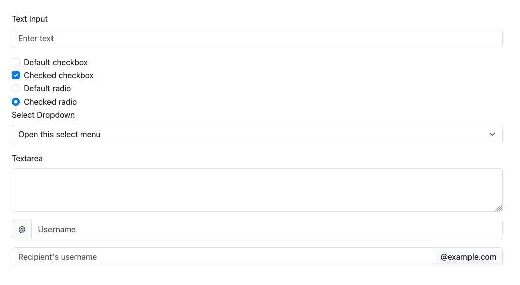
By using these buttons and form controls, you can create interactive and user-friendly forms in your Bootstrap-based web application. Each component is highly customizable and can be easily integrated into your project.
Customizing Bootstrap
While Bootstrap provides a robust set of default styles and components, you may want to customize the framework to better fit the design requirements of your project. Customizing Bootstrap can be done in several ways, ranging from simple overrides to more complex theming.
Basic Customization
One of the simplest ways to customize Bootstrap is by overriding the default styles with your own CSS. You can create a custom stylesheet and include it after the Bootstrap CSS file in your HTML. This way, your custom styles will take precedence over the default Bootstrap styles.
<!DOCTYPE html>
<html lang="en">
<head>
    <meta charset="UTF-8">
    <meta name="viewport" content="width=device-width, initial-scale=1.0">
    <title>Custom Bootstrap</title>
    <!-- Bootstrap CSS -->
    <link href="https://cdn.jsdelivr.net/npm/[email protected]/dist/css/bootstrap.min.css" rel="stylesheet">
    <!-- Custom CSS -->
    <link href="css/custom.css" rel="stylesheet">
</head>
<body>
    <!-- Your content here -->
</body>
</html>
In your custom.css file, you can add your own styles to override the default Bootstrap styles.
/* custom.css */
body {
    background-color: #f8f9fa;
}

.navbar {
    background-color: #343a40;
}

.navbar .nav-link {
    color: #ffffff;
}
Using Pre-fabricated Themes
For more extensive customization, you can use pre-fabricated themes. One popular source for Bootstrap themes is Bootswatch. Bootswatch offers a variety of free themes that you can easily integrate into your Bootstrap project.
To use a Bootswatch theme, simply replace the default Bootstrap CSS link with the link to the Bootswatch theme of your choice. For example, to use the "Cerulean" theme:
<!DOCTYPE html>
<html lang="en">
<head>
    <meta charset="UTF-8">
    <meta name="viewport" content="width=device-width, initial-scale=1.0">
    <title>Bootswatch Theme</title>
    <!-- Bootswatch Cerulean Theme CSS -->
    <link href="https://cdn.jsdelivr.net/npm/[email protected]/dist/cerulean/bootstrap.min.css" rel="stylesheet">
</head>
<body>
    <!-- Your content here -->
</body>
</html>
Bootswatch themes provide a quick and easy way to change the look and feel of your Bootstrap-based web application without having to write custom CSS. Each theme is carefully designed to offer a unique aesthetic while maintaining the core functionality of Bootstrap.
By customizing Bootstrap, either through simple CSS overrides or by using pre-fabricated themes like those from Bootswatch, you can create a unique and visually appealing design that aligns with your project's requirements.