Grid Layout
CSS Grid Layout is really the culmination of decades of user interface design on the web, and CSS's efforts to deliver a layout mechanism to support those designs. CSS Grid can be overwhelming when you look at all the rules and properties available, but if you attack it from a conceptual level first, you'll find it remarkably easy to use - and powerful.
Pro Tip💡 One of the first mistakes people make when looking at CSS Grid is that they assume it's designed like common grid systems available in CSS libraries like Bootstrap, Bulma, Foundation and many others. In these frameworks, developers use CSS classes to define rows and child columns within each row. Most of these frameworks break up each row conceptually into 12 columns, and then each actual column element you add to a row get's a number of columns or column span assigned to it. Moreover, these frameworks typically allow you to specify multiple column spans for each column based on screen size, creating a responsive grid. We'll talk more about frameworks, and in particular Bootstrap later. For now just keep in mind that while there are some similarities, CSS Grid takes a different approach to grid layouts. Be careful not to confuse yourself if you already know Bootstrap grid or other grid frameworks.
Approach CSS Grid with an open mind, and a clean slate - since it's natively built into the browser, it allows for approaches which simply aren't possibly with the older variety of CSS frameworks - which is why it does things differently!
Grid Concepts
CSS Grid Layout is enabled by setting display:grid on an element. That element is considered the grid container, or simply, the grid. In order to begin using the grid, we need to understand two fundamental concepts:
- A grid must be defined, in terms of it's shape. A grid element has a certain number of rows and columns. This grid is abstract, it's not visible on the screen. The grid you define does not directly relate to the number of (child) element you have in the grid.
- Each grid element you add is assigned a specific grid location, and a specific row span and column span.
It's best to think of the grid as the backdrop, or skeleton of the the layout. Individual elements are hung onto the grid at certain locations and spans. As the grid resizes and moves around the screen, the elements you've attached to grid locations move with it.
Pro Tip💡 The important point here is that the grid is part of the grid container element. The grid is not defined by what's in the grid. The grid is uniform - every row has the same number of columns, every column has the same number of rows. Elements are positioned on the grid, and can span multiple rows and columns of the grid - but they are not the grid.
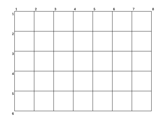
To drive this point home, below is a figure representing just a grid element, with 8 grid column lines and 6 grid row lines. We'll see in a moment how we define the number of grid lines, right now just keep in mind - they are imaginary - they are not drawn. The words grid lines are important - we are talking directly about the lines, not the cells. We attach elements to the lines, and the elements occupy the cells. More specifically, we typically call the area between row grid lines row tracks, and the area between column grid lines column tracks. Elements will occupy a certain number of row tracks and cell tracks.
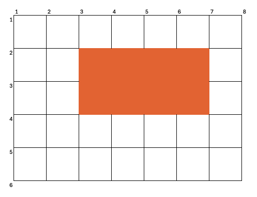
If we were to attach a div to column line 3, row line 2, with a column span of 4 and row span of 2, we'd be positioning the div as follows:
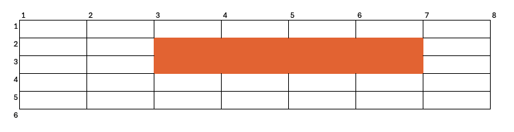
If we were to resize this grid, the grid and column lines will move - such that they remain and equal distance apart. When those lines move, the element attached to them resizes too.
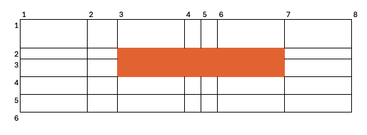
In the example above, each grid line was equidistant, the grid row and column tracks were of equal size. That is not required, however. We can also resize (or originally define) the grid so some rows are larger than others, and likewise with columns. Assuming the attached elements are still attached to the same positions along the grid however, they simply resize accordingly.
The element we've positioned on the grid is attached such that the top left corner is at row line 2, column line 3, and the bottom right corner is at row line 2 and column line 7.
No matter where those grid lines move to, the element's corners move with them - and thus the element is resized.
Defining the Grid - by column and row
Let's start by creating a grid in the simplest way possible. The grid will have 3 rows, 3 columns, and they will be of equal track size.
.grid-container {
    display: grid;
    grid-template-columns: 1fr 1fr 1fr;
    grid-template-rows: 100px 100px 100px;
}
<section class=.grid-container>
    <!-- We need to put things here..-->
</section>
If you were to view this in the browser, you won't see anything (no grid), because there are no elements attached to it. It's just an empty section element. Let's look at the properties we defined though:
grid-template-columns property consists of a series values, separated by whitespace. The values represent the space between the column lines. 2 values would indicate 3 grid lines, 2 columns. In our case, 3 values indicates 4 grid lines, 3 columns. We've defined the space using a new unit of measure - fr. fr represents fractional unit. 1fr means "one fractional unit" - or one part of the available space. In this context, the available space is the width of the container (which all things being equal, would be 100% the width of the page). Think of 1fr to be width if you divided the available space by the number of fr values defined. We've defined three fr unit values, and as such, 1fr represents 1/3 of the space available.
If we have set grid-template-columns to 1fr 2fr 1fr;, then we would have defined four fr units, and each 1fr would be 25% of the available space. We'd have three columns still, but the middle column would be twice as wide as the others. When we resized the grid element, we'd still have three columns with the middle being twice as wide.
grid-template-rows property uses the same syntax - in this case three values separated by white space. This property controls the number of rows, and the spacing between the row lines. Just like with grid-template-columns, we've defined 3 rows, 4 grid row lines. We didn't use fr here, because normally an element's height is defined by it's children - it doesn't have a predefined height. The concept of "available height" is less useful, because pages normally can scroll vertically as long as you want. It's more common, unless the grid has an artificial constraint on height, to use fixed sizes for the row track spacing.
Adding elements
OK, so let's add some elements to the grid. Let's define some CSS just to control the visuals a bit - each div element will have a border, and a shade.
.grid-container > div {
    background-color: lightblue;
    border: 3px dotted navy;
}
<h4>Grid Container</h4>
<div class="grid-container">
    <div>1</div>
    <div>2</div>
    <div>3</div>
    <div>4</div>
    <div>5</div>
    <div>6</div>
    <div>7</div>
    <div>8</div>
</div>
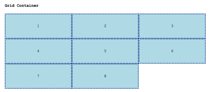
Pretty simple. If the grid is resized, all the elements stay position in the same arrangement. Eight elements, for nine grid cells - and they filled left to right, top to bottom, leaving the last grid cell empty.
We can get a lot more sophisticated though. The example above just provided the default arrangement. Each element can be defined such that it is attached anywhere on the grid, and with any row or column span. To do this, we need to reference grid lines and grid columns.
grid-row and grid-column
The first way we can do this is by directly specifying an individual element's row, column, and corresponding spans.
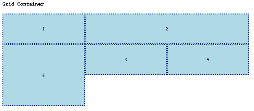
Let's assign some classes to some of the grid elements so we can do this more easily:
<h4>Grid Container</h4>
<div class="grid-container">
    <div>1</div>
    <div class='a'>2</div>
    <div>3</div>
    <div class='b'>4</div>
    <div>5</div>
</div>
Let's position element 2 such that it spans 2 columns - starting at grid line 2 and ending at grid line 4. Let's do the same, but with rows, for element 4 - starting at row line 2 and ending at row line 4:
.a {
    grid-column-start: 2;
    grid-column-end: 4
}
.b {
    grid-row-start: 2;
    grid-row-end: 4;
}
The grid-column-start, grid-column-end and corresponding row properties each take an implicitly defined grid line number.
Pro Tip💡 Yes. The first column is column 1. I know. In Computer Science, the concept of things starting with 1 has been beaten out of you, and you expect that series start with 0. This is not the case with CSS grid. CSS in general tends to use 1 as the first number. For example, :nth-child, the first child is n=1. There's nothing forcing us to start with 0, it's just that with most programming languages, we do. It's been argued persuasively that starting with 0 works best for general purpose languages, and C-based languages (and many others) adopted this pattern. CSS simply didn't, and it's ok - it's not a general purpose language anyway!
There's a few equivalent notations that will achieve the same result. First, we can specify grid-*-end by span rather than absolute position. Instead of stating that the element ends at column line 4, we could also say it spans two columns. CSS is of course able to compute it's end position for us based on where it started.
.a {
    grid-column-start: 2;
    grid-column-end: span 2;
}
.b {
    grid-row-start: 2;
    grid-row-end: span 2;
}
The use of span is usually more flexible, since if you want to move the element around the grid, you can stick to simply changing the grid-*-start and the grid-*end value will be recomputed.
Since we usually specify both start and end, we can do so with one combined property too, with the start and end separated by a /:
.a {
    grid-column: 2 / span 2;
}
.b {
    grid-row: 2 / span 2;
}
Grid Area Abstractions
Thus far, we've positioned elements on the grid by directly referring to grid lines. This is ok, but we are tying elements to specific characteristics of the grid - there's a tight coupling. To motivate the decoupling discussion, imagine you have two grids.
/* The original 3x3 grid */
.grid-container-1 {
    display: grid;
    grid-template-columns: 1fr 1fr 1fr;
    grid-template-rows: 100px 100px 100px;
}

/* Another grid, with a lot more cells.*/
.grid-container-2 {
    display: grid;
    grid-template-columns: repeat(3, 1fr) 2fr 1fr;
    grid-template-rows: repeat(3, 25px) repeat(2, 50px);
}
Take a look at the definition of .grid-container-2, as we've introduced some new ways of defining grids. The repeat function simply generates a sequence of size values. The columns of the grid are 1fr 1fr 1fr 2fr 1fr1, and the rows are 25px 25px 25px 50px 50px.
Now, let's assume we have to place a child element on both grids, and the elements have most of the same characteristics:
.special {
    background-color: pink;
    border: 4px solid red;
}
We always want this special item to be in the middle cell, spanning a few columns, but it's exact positioning is up to the grid. Let's look at some HTML:
<div class="grid-container-1">
    <div class='special'>SPECIAL</div>
</div>

<div class="grid-container-2">
    <div class='special'>SPECIAL</div>
</div>
How do we define the row and column for .special elements? We clearly can't put it in the .special rule, since the element will be positioned in a different location depending on the grid it appears in. One option is to define another set of classes, one that defines the grid position of special elements inside grid-container-1, and another that defines position within grid-container-2:
 .special-grid-1 {
    grid-column: 2 / span 1;
    grid-row: 2 / span 1;
 }
.special-grid-2 {
    grid-column: 2 / span 3;
    grid-row: 4 / span 2;
}
<div class="grid-container-1">
    <div class='special special-grid-1'>SPECIAL</div>
</div>

<div class="grid-container-2">
    <div class='special special-grid-2'>SPECIAL</div>
</div>
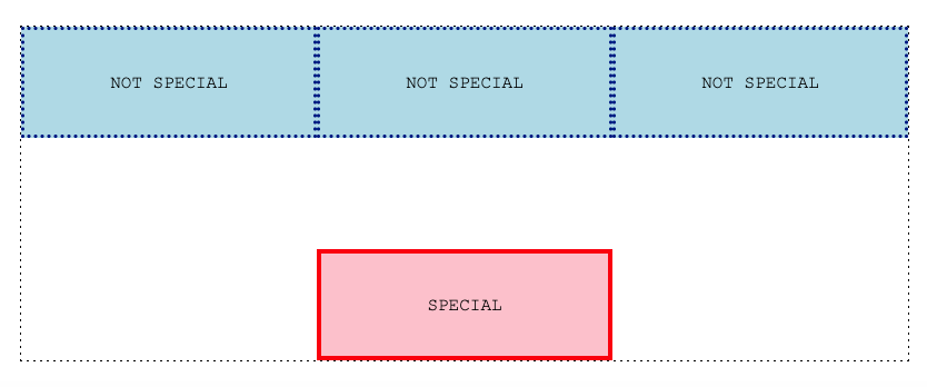
We get reasonably centered special blocks in both now:
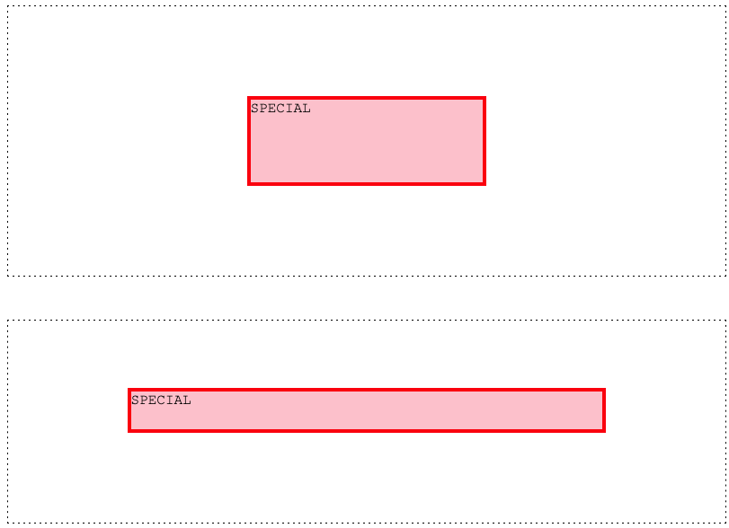
The reasonably part is because this all depends on the grids. A third grid where special elements appear would require a third class, with specific column and row positions approximating the center of the grid.
What we have here is control inversion. It's the grid that controls where a "centered-ish" item should go - it controls it by defining it's grid sizes. But the way we have the CSS designed, it's the child element - the one being positioned - that is specifying where it goes.
The solution to this problem is creating a layer of abstraction. This abstraction allows us to avoid child elements using grid position directly to specify where they go. The abstraction centers on the ability for the grid element to define regions - or areas, and allow children to refer to those areas. The grid controls where the area is within the grid, and the children can just specify which area they should be added to.
Grid Area Specification
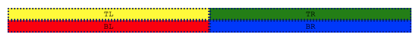
Let's lay out a 2x2 grid using the techniques from above:
.grid-container {
    display: grid;
    grid-template-columns: 1fr 1fr;
    grid-template-rows: 1fr 1fr;
}
We can create 4 classes that add elements to the 4 corners of the grid:
.top-left {
    grid-row: 1;
    grid-column: 1;
}
.top-right {
    grid-row: 1;
    grid-column: 2;
}
.bottom-left: {
    grid-row: 2;
    grid-column: 1;
}
.bottom-right {
    grid-row: 2;
    grid-column: 2;
}
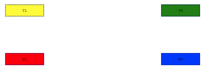
Here's the HTML and result:
<div class="grid-container">
    <div class='top-left'>TL</div>
    <div class='bottom-left'>BL</div>
    <div class='top-right'>TR</div>
    <div class='bottom-right'>BR</div>
</div>
Now let's add a layer of abstraction, so the grid defines where the top / bottom / left / right corners are, and the child classes specify those regions by name instead. First, we must add grid-template-areas property to the grid element itself:
.grid-container {
    display: grid;
    grid-template-columns: 1fr 1fr;
    grid-template-rows: 1fr 1fr;

    /* We are defining named areas */
    grid-template-areas:
        'top-left       top-right'
        'bottom-left    bottom-right';
}
The details matter here! grid-template-areas requires one string (surrounded with single quotes) per row, as defined by grid-template-rows. Within each string, there must be individual column names, one for each columns as defined by grid-template-columns (stay tuned, because we'll learn some more flexibility around this in a moment). Column names are separated by whitespace. It's customary to write out the names in a nicely aligned grid pattern, using new lines, spaces, tabs - but it's not required.
The names are describing the position implicitly. top-left is an area that corresponds to the first row/column track. We are, in effect, drawing our grid, with labeled areas!.
Now we can change the elements, such that instead of referring to grid-row and grid-area for positioning, they refer to the corresponding named area.
.top-left {
    grid-area: top-left;
}
.top-right {
    grid-area: top-right;
}
.bottom-left: {
    grid-area: bottom-left;
}
.bottom-right {
    grid-area: bottom-right;
}
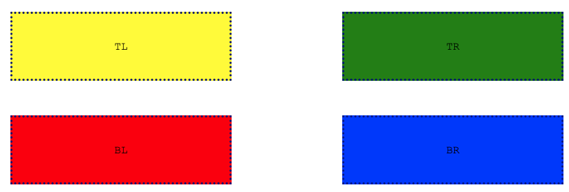
The result is exactly the same. However, we've shifted control of the positioning back to the grid element. Now, the grid element can rearrange it's areas, and without modifying the HTML or CSS of any of it's children, the elements will still be positioned accordingly.
For example, we can flip the grid regions along both axes:
.grid-container {
    display: grid;
    grid-template-columns: 1fr 1fr;
    grid-template-rows: 1fr 1fr;

    /* We are defining named areas */
    grid-template-areas:
        'bottom-right   bottom-left'
        'top-right      top-left';
}

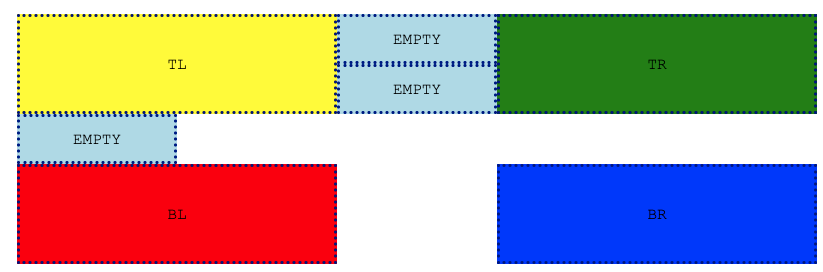
We can also change the grid dimensions entirely, creating a grid with many more cells. As long as we still define the areas the children elements refer to, they will be positioned accordingly.
.grid-container {
    display: grid;
    grid-template-columns: repeat(5, 1fr);
    grid-template-rows: repeat(5, 50px);

    /* We are defining named areas */
    grid-template-areas:
        'top-left    . . .  top-right'
        '.           . . .  . '
        '.           . . .  . '
        '.           . . .  . '
        'bottom-left . . .  bottom-right';
}
In the CSS above, we make use to the . notation to represent unnamed cell areas. The ., or any sequence of uninterrupted . (ie ...) are interpreted as a cell without a name. The notation defines all 25 cells in a 5x5 grid, but only the corners are actually named.
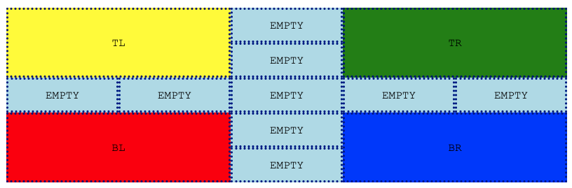
We can also expand regions, but repeating their names in the grid coordinate cells. Let's expand the corners out a bit on the last grid:
.grid-container {
    display: grid;
    grid-template-columns: repeat(5, 1fr);
    grid-template-rows: repeat(5, 50px);

    /* We are defining named areas */
    grid-template-areas:
        'top-left    top-left    . top-right     top-right'
        'top-left    top-left    . top-right     top-right '
        '.           .           . .             . '
        'bottom-left bottom-left . bottom-right  bottom-right'
        'bottom-left bottom-left . bottom-right  bottom-right';
}
We can also add additional children, and they'll just flow right into unoccupied grid cells!
<div class="grid-container">
    <div class='top-left'>TL</div>
    <div>EMPTY</div>
    <div class='bottom-left'>BL</div>
    <div>EMPTY</div>
    <div class='top-right'>TR</div>
    <div>EMPTY</div>
    <div class='bottom-right'>BR</div>
    <div>5</div>
</div>
The source location of the unpositioned cells isn't important. We can fill in all the remaining cells just with a string of divs if we want at the end:
<div class="grid-container">
    <div class='top-left'>TL</div>
    <div class='bottom-left'>BL</div>
    <div class='top-right'>TR</div>
    <div class='bottom-right'>BR</div>
    <div>EMPTY</div>
    <div>EMPTY</div>
    <div>EMPTY</div>
    <div>EMPTY</div>
    <div>EMPTY</div>
    <div>EMPTY</div>
    <div>EMPTY</div>
    <div>EMPTY</div>
    <div>EMPTY</div>
</div>
Named rows and columns
Areas aren't the only things that can be named - sometimes it's useful to name rows and columns too. Take the following, with 4 column grid lines and four row grid lines:
.grid-container {
    display: grid;
    grid-template-columns: 1fr [special-column] 1fr 1fr;
    grid-template-rows: 100px 100px [special-row] 100px;
    border: dashed black 1px;
    margin-block: 3em;
}

.special {
    background-color: pink;
    border: 4px solid red;
    grid-column: special-column / span 1;
    grid-row: special-row / span 1;
}
We've attached a name to column grid line 2 and row grid line 3 by putting a label within square brackets directly preceding the sizing value. You can name any row/column, or none at all - it's your choice. Once you've named them though, you can refer to them when specifying the location of other elements - as we've done with the .special element. The indirection created by naming the row and column lines within the grid itself allows child element to reference where they should be positioned without coupling those specifications to literal line numbers. This allows the grid itself to change, and child elements to remain unchanged.
More info can be found on the MDN
Shortcut Properties Abound
One of the things about CSS Grid that makes it hard to learn is that there are so many variations on how to specify the type of things we've just covered. We saw that, for example grid-row-start and grid-row-end can be collapsed into grid-row. We saw that rather than specifying 5 equal columns as 1fr 1fr 1fr 1fr 1fr we can just do repeat(5 1fr). Shortcuts like these, and others, can be combined - which creates a very powerful framework for specifying layout, but also a difficult learning environment. grid-template is a combination of grid-template-rows, grid-template-columns, and grid-template-areas.
We won't enumerate all the various ways we can combine row, column, and area specifications here. You've seen the core techniques, and you can learn about the various properties that provide shortcut specifications on the MDN's grid resource page.
Controlling Alignment, Spacing, etc
Just like with Flexbox, CSS grid also allows you to control how elements fill, align, and arrange within grid cells. The properties that we use will sound familiar, because they are analogous to Flexbox's properties.
Gaps Between Rows and Columns
The elements that occupy cells within a grid will be directly adjacent to each other, unless you've added additional margins to the child elements. While it's certainly possible to create uniform gaps between tracks of rows and columns using margins, to do so is tedious and error prone, and suffers a bit from the same inversion of control problem we talked about and addressed with named grid areas.
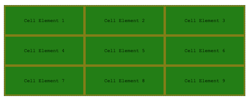
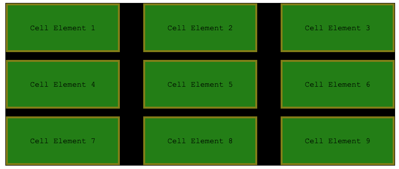
Here's a standard grid, without any spacing between "cells":
.grid-container {
    display: grid;
    background-color:black;
    grid-template-columns: 1fr 1fr 1fr;
    grid-template-rows: 100px 100px 100px;
    border: dashed black 1px;
    margin-block: 3em;
}

div {
    background-color: green;
    border: 4px solid olive;
}
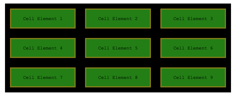
Notice how there is no space between cells, and the black background set on the grid is not visible at all. We could add margins to all div elements to space things out:
div {
    background-color: green;
    border: 4px solid olive;
    margin: 1em;
}
 This may be fine for you some situations, but if there are multiple classes/element types being added to the grid, they all need to specify margins themselves - which is more difficult to maintain. The
 gap property can be used on the grid itself to create spacing between the tracks, which can be far more powerful:
.grid-container {
    display: grid;
    grid-template-columns: 1fr 1fr 1fr;
    grid-template-rows: 100px 100px 100px;
    border: dashed black 1px;
    gap: 1em;
    margin-block: 3em;

}
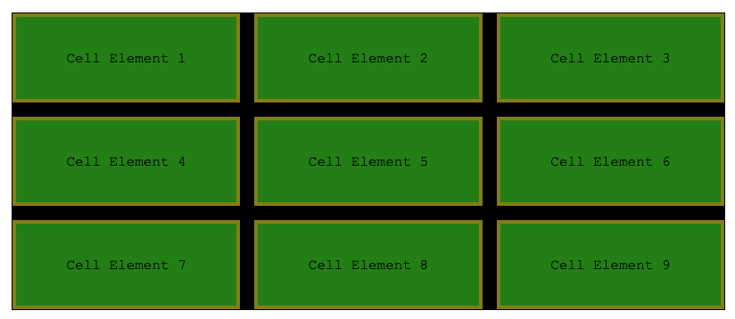
Notice an important distinction - gap only affects spacing between tracks - there is no additional spacing applied to the topmost, bottom, leftmost, and rightmost areas. To add spacing to those, you can simply used padding-* on the grid element.
gap is actually a shorthand, for row-gap and column-gap, which can be used independently:
.grid-container {
    display: grid;
    grid-template-columns: 1fr 1fr 1fr;
    grid-template-rows: 100px 100px 100px;
    border: dashed black 1px;
    row-gap: 1em;
    column-gap: 3em;
    margin-block: 3em;

}
Justification - (horizontal)
Similarly to Flex, items can be arranged horizontally across a row using justification. When the elements within cells occupy less space than available (the space between the column lines), then use justify-items to specify whether elements should be pushed to the left (start), right (end), centered (center), or stretched (stretch). The default value is stretch.
This property affects the alignment of all columns in the grid. If you want to adjust individual elements, you can use justify-self on the actual child element. Here's a few examples:
.grid-container-1 {
    display: grid;
    background-color: black;
    grid-template-columns: 1fr 1fr 1fr;
    grid-template-rows: 100px 100px 100px;
    border: dashed black 1px;
    justify-items: start

.grid-container-2 {
    display: grid;
    background-color: black;
    grid-template-columns: 1fr 1fr 1fr;
    grid-template-rows: 100px 100px 100px;
    border: dashed black 1px;
    justify-items: center

div {
    background-color: green;
    border: 4px solid olive;

.end {
    justify-self: end;
}
<h1>justify-items: start</h1>
<div class="grid-container-1">
    <div>1</div>
    <div>2</div>
    <div>3</div>
    <div>4</div>
    <div>5</div>
    <div class="end">6</div>
    <div>7</div>
    <div>8</div>
    <div>9</div>
</div>
<h1>justify-items: center</h1>
<div class="grid-container-2">
    <div>1</div>
    <div>2</div>
    <div>3</div>
    <div>4</div>
    <div>5</div>
    <div class="end">6</div>
    <div>7</div>
    <div>8</div>
    <div>9</div>
</div>
Alignment - (vertical)
Alignment works the same as justification, controlling the vertical alignment of elements within cells. When the elements within cells occupy less space than available (the space between the row lines), then use align-items to specify whether elements should be pushed to the top (start), bottom (end), centered (center), or stretched (stretch). The default value is stretch. Just like justification, you can use align-self on individual child elements to make their alignment different than the value specified on the grid itself.
Justification and Placement
Notice that the values for align-items are identical to justify-items. start refers to either left or top, end refers to either right or bottom, and center and stretch mean the same thing, the only difference being whether we are specifying the grid as centered or stretched horizontally or vertically. If you want to set both alignment and justification in one shot, you can use the place-items rule - which takes the alignment and then justification, separated by /. You can also just specify one, and it will be used for both.
.grid {
    display: grid;
    /*aligned vertically to the top, horizontally to the right */
    place-items: start / end;

    /* or center horizontally and vertically... */
    place-items: center;
}
Justify and Align Content
Sometimes, the total space occupied by the grid element is less than the available space for the parent grid element. This is less common, but can occur when you've used non-flexible sizing parameters for grid track widths. In this case, you can use justify-content and align-content (notice the use of -content instead of -items).
/* Packs the columns to the left */
justify-content: start;

/* Packs the columns to the right */
justify-content: end;

/* Packs the columns and centers them within available space */
justify-content: center;

/* Resizes to use available space */
justify-content:  stretch;

/* Puts an even amount of space around the element, with half the space on the edges */
justify-content: space-around;

/* Puts an even amount of space between tracks, with no space at the edges */
justify-content: space-around;

/* Puts an even amount of space between tracks, with the same space on the edges */
justify-content: space-evenly;
To achieve the same effect vertically, use align-content.
Pro Tip💡 Aligning/Justifying content is more similar to creating gap values than using align-items and justify-items. It's creating space between tracks, where align-items and justify-items is moving elements within tracks.
Wrapping up Grid
CSS grid is the most powerful and feature packed layout system yet, and when combined with flex and basic flow layout, you'd be very hard pressed to find a layout that you cannot create with the tools we've discussed. There's more though... in addition to all of the short cut variations of syntax, we also skipped things like CSS subgrid, masonry, along with more sizing techniques like min-content and max-content. You are encouraged to look at the wonderful tutorial and fact sheet on CSS-Tricks for some more details!