Flexbox Layout
We've seen Flow Layout, and positioning - relative, absolute, fixed, and sticky. With the exception of "sticky", these layouts have been around for decades. They are adequate, and for many situations they continue to be the right choice. That said, modern web development - especially for applications rather than static text-based sites - often demand more. This is where Flexbox and Grid layout step up for us. Both layout methods are still just "candidate" recommendations to the official W3C CSS standard at time of writing (2025), however they are supported by over 99% of desktop web browsers and 100% of mobile web browsers. They are, essentially, standard layout techniques.
One aspect of the layout methods we've already seen is that parent container elements have limited (if any) ability to control the sizing of their children elements. Parent containers typically grow to accommodate their children, unless you've prevented them from doing so (such as, by setting height, or max-width, etc). When that occurs, the parent can implement scrolling, or the content of the children can simply be clipped, or it can overflow the parent. When child element contents is smaller than the available space within a parent container, the child just simply uses the space it needs - unless you've set up a rule to force it to expand (ie. width:100%). The arrangement of the child within the parent container is also mostly controlled by the child, through margins.
Flexbox has a different take on this. These layouts provide parent container elements with tools to align, distribute, space out, and order child elements - manipulating their size to make best use of space. These new abilities powerful, and really shine when we start thinking about designs that are responsive to screen sizes and orientations. Flexbox layout is an collections of CSS rules - governing the flex container, and the flex items. When we refer to flex container, we mean the a parent element whose display has been set to flex or inline-flex. When we refer to flex items, we mean the child elements within a flex container.
What happens when you make an element's display flex or inline-flex? Actually, not much - flex elements behave just like block elements you normally, and inline-flex behave just like inline-block. When we place an element with flex or flex-inline inside a parent element using flow layout (or positioning), the layout of the flex container is just what it would be under the block and block-inline rules. Flex containers are positioned on the page just like flow elements - what makes them special is how their children - flex items - are positioned within them.
Pro Tip💡 This concept trips people up. If you set the display of an element to flex, and that element just has a plain old p element inside of it, you will see no perceptible difference compared to if that same parent element's display was block. To repeat - flex containers effect their children, not themselves!
Flex axis
Flex items (the flex container's children) will be laid out in row -> column order, or column -> row order - depending on how you set up the flex container. First let's look at the default - row -> column. Let's create a flex container with 3 paragraph (block) elements, containing short text strings. To make things easier to visualize, we'll put a dashed border on the flex container, and a solid border on the flex items. We'll use a padding and margin of 1em all around for all elements too.
.block-container {
    /* This is a block container, the default */
    padding: 1rem;
    border: dotted black 3px;
}
.flex-container {
    display: flex;
    padding: 1rem;
    border: dashed black 3px;
}
p {
    padding: 1rem;
    margin: 1rem;
    border: solid black 2px;
}
<h4>Block (Flow) Container</h4>
<div class="block-container">
    <p>A</p>
    <p>B</p>
    <p>C</p>
</div>
<h4>Flex Container</h4>
<div class="flex-container">
    <p>A</p>
    <p>B</p>
    <p>C</p>
</div>
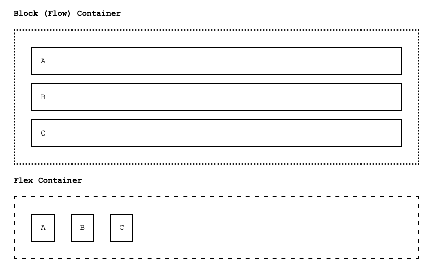
What jumps out is that the flex container appears to have turned it's children into inline-block elements! That's sort of true, but there's more to it. The flexbox container has arranged the elements from left to right, based on how much space they need - while honoring the element's margins and padding. All other attributes are honored as well - we could add a height to the middle paragraph, and a width to the first, and flex will be just fine with it - but it will do something interesting.
<div class="flex-container">
    <p style="width: 200px">200px width</p>
    <p style="height:200px">200px height</p>
    <p>C</p>
</div>
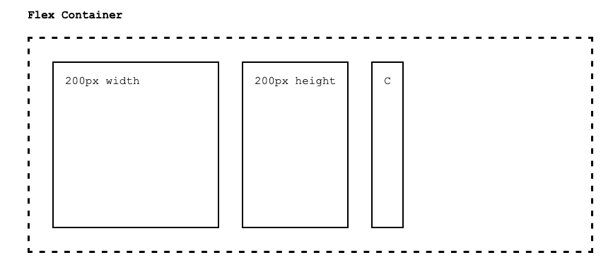
The flex container honored the middle paragraph's height, but it leveled things up by setting all the flex items to have that height! Note that only happened with height though, it didn't resize the items to match the first paragraph's width.
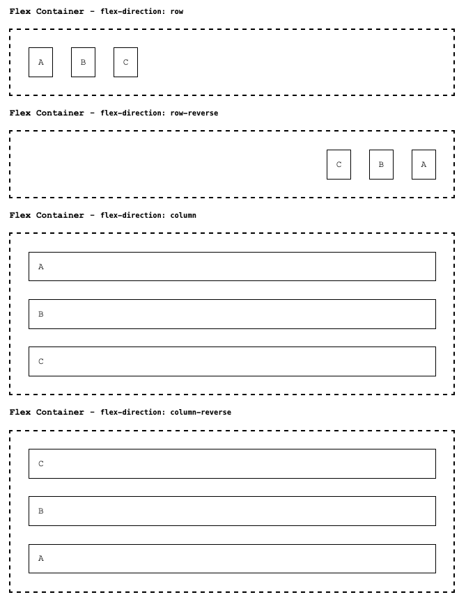
Before moving on, recall that the above examples simply use the default axis arrangement for flexbox. One of the important concepts built into flexbox is the notion that the direction of arrangement is often an important concept to control when creating complex layouts. To address this, flexbox uses two terms to differentiate axes - the main-axis and the cross-axis. You can think of these as the X (main-axis) and Y (cross-axis), but that's only when flexbox is set up to use the default flex-direction - which is row.
Let's see the same example, but this time with the other flex-direction values:
flex-direction: row- the items arrange along rows, left to right (reversed if the HTML documentdiris set tortl)flex-direction: row-reverse- the items arrange along rows, right to left (reversed if the HTML documentdiris set tortl)flex-direction: column- the items arrange along columns, top to bottom (reversed if the HTML documentdiris set tortl)flex-direction: column-reverse- the items arrange along columns, bottom to top (reversed if the HTML documentdiris set tortl)
Note the flex-direction property is simply set on the flex container itself, the items are not changed.
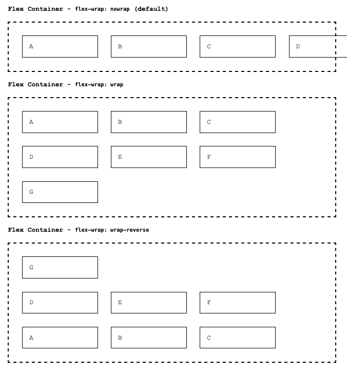
Flex Wrapping
In the examples above, we only have one row, or one column, because there was plenty of space to fit all the elements in a single run. This of course won't always be the case. Let's push the limits by adding more paragraph flex items, and also setting their min-width to be more than can fit one one run.
p {
    padding: 1rem;
    margin: 1rem;
    border: solid black 2px;
    min-width: 150px;
}
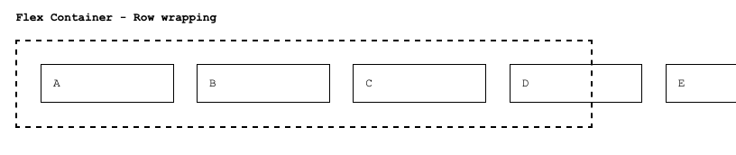
We initially get the same sort of overflow we've seen with block elements. We could use the overflow property on the parent to achieve clipping and scrolling, but with flexbox, we can also achieve wrapping by setting the flex-wrap property on the container
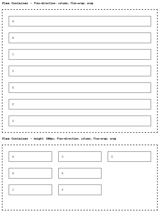
When flex direction is set to column (or column-reverse) we only see wrapping if the height of the flex container is constrained somehow - since otherwise it will simply grow to accommodate all the items. In the figure above, you can compare how things work with the column direction. The items occupy full width, and the container grows to accommodate under normal circumstances. When we place a maximum height on the flex container, however, the child elements are positioned to wrap - but since we set flex-direction to column, the wrapping is happing top -> down, then left right!
Flex Alignment (the stretch)
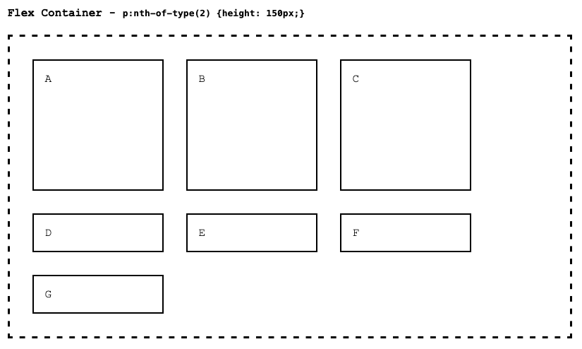
An important feature of flexbox is how we can control the sizing of the flex items by defining properties on the flex container. Let's return to one of our first examples, where we saw that setting the height of just one of the flex items caused the sibling items to stretch as well:
.flex-container {
    display: flex;
    padding: 1rem;
    border: dashed black 3px;
}
p {
    padding: 1rem;
    margin: 1rem;
    border: solid black 2px;
    min-width: 150px;
}
p:nth-of-type(2) {
    height: 150px;
}
<div class="flex-container">
    <p>A</p>
    <p>B</p>
    <p>C</p>
</div>
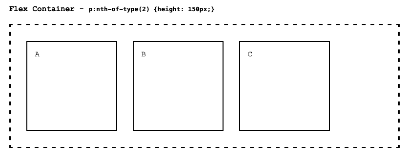
Note that if we had more items, creating additional rows (flex-wrap: wrap), the height of the elements in new rows would be unaltered.
This behavior is controlled by the flex containers align-items property. The default value is stretch, and it does just that - it stretches the content of all items within a single row (or column, if flex-direction is set to column) to match the height (or width) of the largest. We can change this behavior, and use any of the following for align-items:
-
flex-start- aligns the top (or left, forflex-direction: column) of the elements, keeping their natural height (or width, ifcolumn)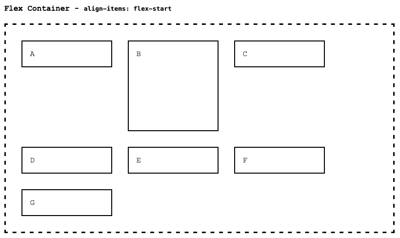
-
flex-end- aligns the bottom (or right, forflex-direction: column) of the elements, keeping their natural height (or width, ifcolumn)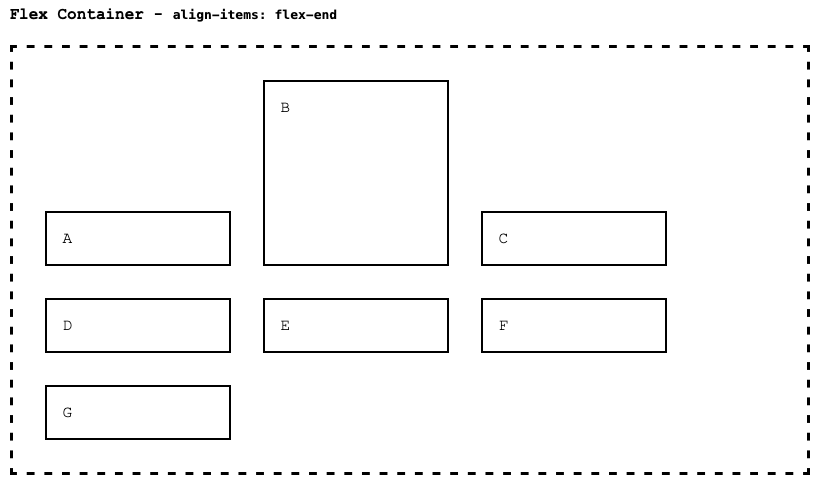
-
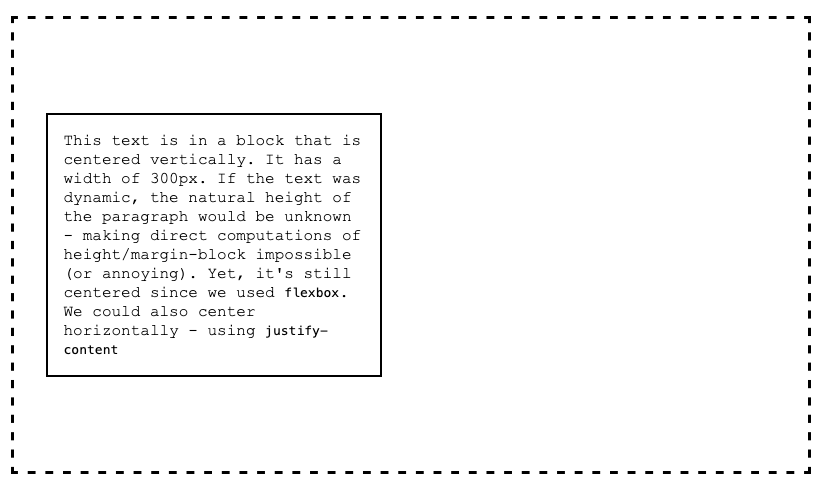
center- centers the elements, using their natural height, along the vertical axis (or along the horizontal ifflex-direction:column). This is a big one - it's the best way to center content vertically within a parent container - something that we mentioned was extremely difficult with normal flow layout!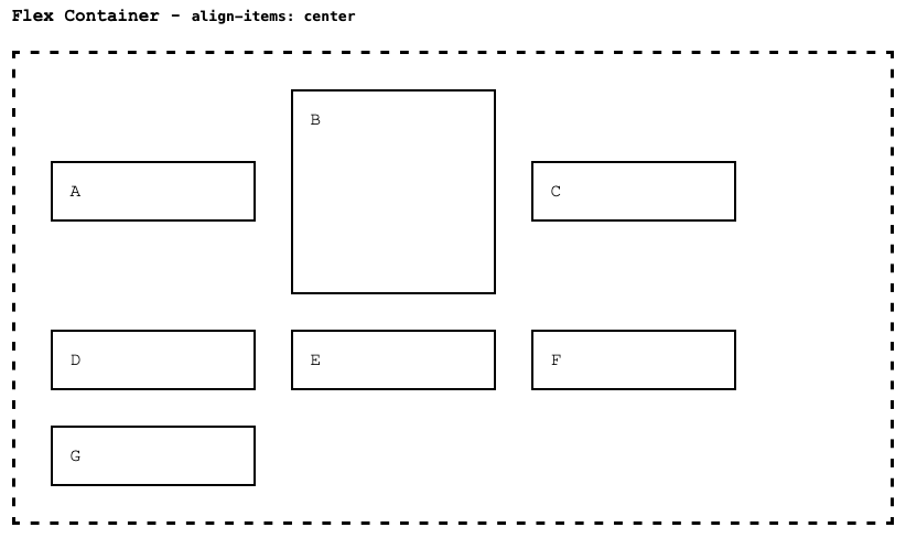
Pro Tip💡 Imagine you have a parent element that doesn't fix it's own height. Perhaps it's controlled by something else. Or (or also), you don't control the child element's height - perhaps because it's content is dynamic. Nevertheless, you want the child item vertically centered within in - with equal spacing at the top and bottom. This is a common layout requirement, and it's really hard without flexbox. With flexbox, you simply set the parent element's display to flex or inline-flex depending on your needs, and set align-items to center. By default, the child element will have it's natural height, and be centered vertically within the element.
-
baseline- aligns the baselines of the text content of the flex items, honoring their natural height. This one is important if you are trying to line up text along the left->right axis, while keeping the items somewhat centered.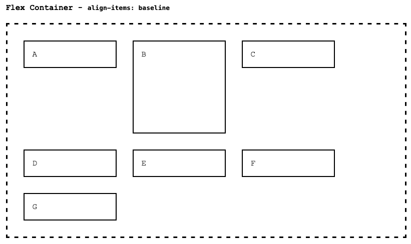
-
stretch- the default, stretch to match the largest item!
align-items controls the expansion and alignment along the cross-axis. For flex-direction: row, the main-axis is left to right, and the cross-axis is top to bottom. For flex-direction: column, the main-axis is top to bottom, and the cross-axis is left to right. Mirror these for row-reverse and column-reverse.
Pro Tip💡 For clarity, we'll stop qualifying "row" by saying "or column, when flex-direction is column". Suffice to say, when you change flex-direction, all of the rest of the properties are essentially reinterpreted to apply to different axes and directional flows. Feel free to experiment, but since right to left is the most common, and most intuitive, most of our examples will use this direction.
Flex Justification
Alignment is for cross-axis, and justification is for the main-axis. When the overall widths of elements is less than what is available along the main axis, we see that elements just sort of stack up, left to right:
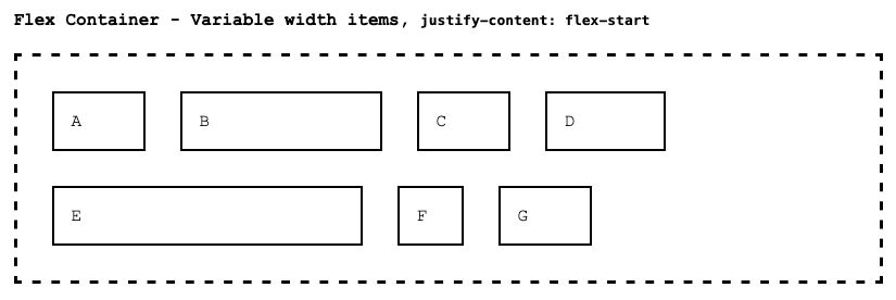
This behavior is controlled by justify-content on the flex container. flex-start is the default, but we have other options:
flex-end- items stack up in reverse order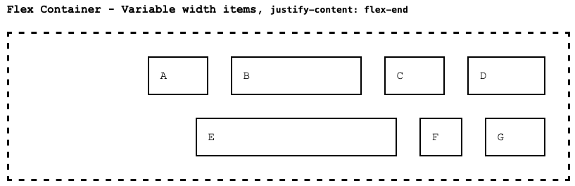
center- items are centered - with the same spacing between the left side of container and first item as the the space between the right side of the container and the last item.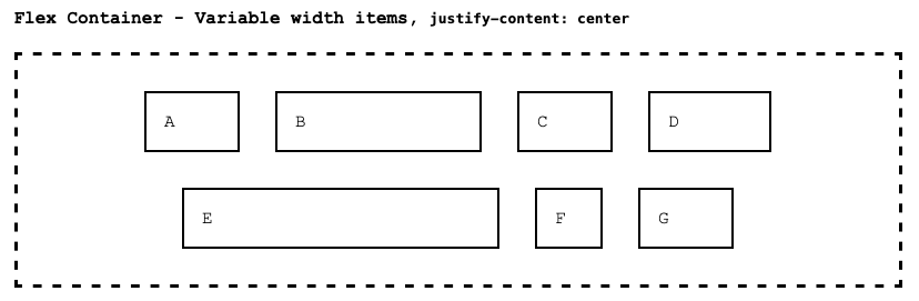
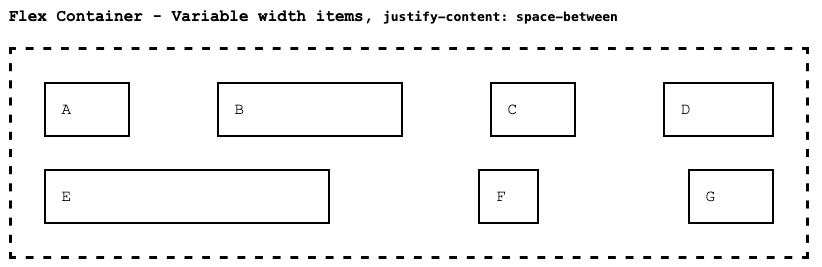
space-between- items are spaced evenly (equal space between each), with no space along the edges (other than the padding/margins).
space-around- items are spaced evenly, but they don't actually have equal space between them. The spacing value is computed by taking the overall width, subtracting the sum of the item widths, and then dividing by the number of items times 2. Then, that spacing is applied to the left and right of each item. Items at the ends have only one spacing, while items that are adjacent to others end up with two spacings between them. It's a little hard to explain, but it actually looks pretty intuitive!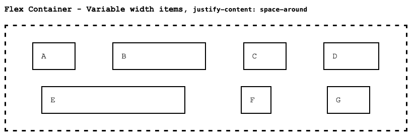
space-evenly- items are spaced evenly, with equal spacing between elements as between elements and the edges.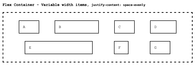
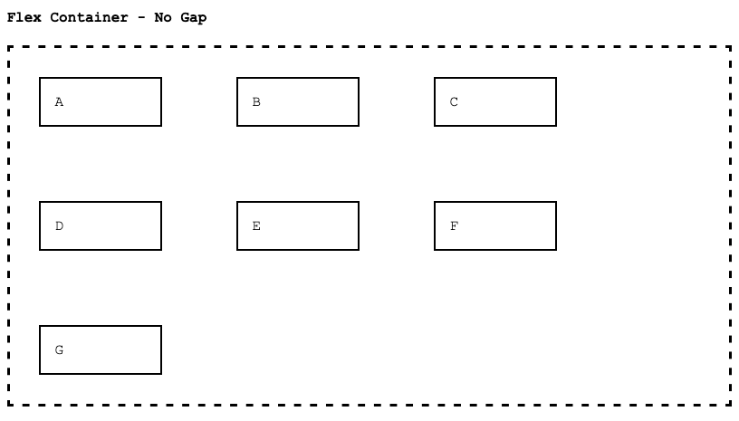
Flex Gap
We can also directly control the spacing (actually, the minimum spacing) between elements. When we say "between" elements, we are specifically talking about spacing between flex items, not spacing at the edges of the flex container. As a simple example, let's use our standard set of paragraph elements, with a width of 100px. This normally would stack as follows:
By setting a gap of 20px however, we significantly increase this spacing in both the main-axis and cross-axis.
If we only want to specify the gap along rows, or columns, we can use row-gap and column-gap.
.flex-container{
    row-gap: 100px;
    column-gap: 20px;
}
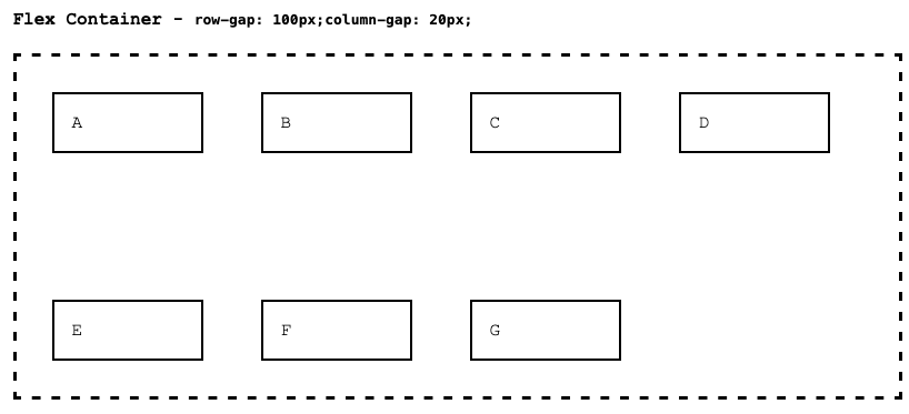
A shortcut to specifying both (when you want to specify both) is to use gap: <row> <col>.
.flex-container {
    /* Same as specifying row-gap: 100px and column-gap: 20px */
    gap: 100px 20px;
}
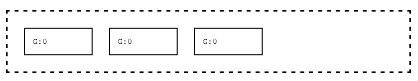
Flex Items - grow, shrink
Everything we've discussed so far is specified the flex container itself. There is another level of control we can apply, and these controls are specified directly on the individual flex items. Let's cover sizing first: When there is available space, we can size elements indirectly using justify-content, but we can also instruct elements to take up more or less space relative to their siblings. We do this by specifying relative grow or shrink values on the individual flex items.
The easiest way to think about this is to remember that all flex items started out with their grow value set to 0. This means, each flow item will grow equally, when there is available space within the flex container. However, we can also change this value - and any change will cause the rates of growth to change accordingly.
Let's start out with a simple flex container, with it's spacing set to default (flex-start). There will be some wrapping, and each flex item has a min-width set to 100px;
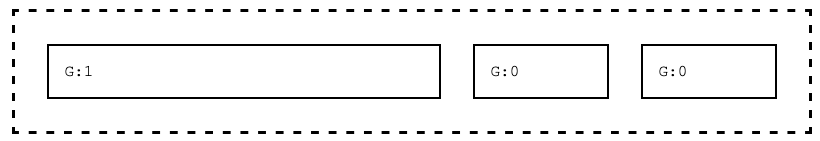
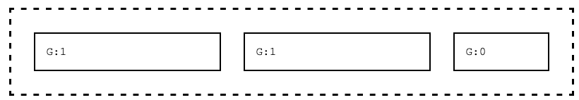
Now, let's set the first element's flex-grow value to 1. With the rest of the flex items having a flex-grow set to 0, this means that the first item will grow to take up all the available extra space. The items with flex-grow of 0 do not grow, they use their natural sizing exclusively.
We can adjust values of all the flex items however. In the example below, two elements have flex-grow set to 1, so they share the available extra space equally (while the flex-grow: 0 doesn't grow at all).
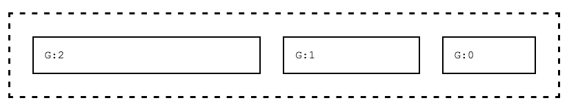
The relative values of flex-grow control the proportion of space used by each. So, in the example below, the first element still has flex-grow set to 1, but the middle item has flex-grow set to 2. The second item now grows to take up twice the amount of extra space than the first item.
The flex-grow property has a counterpart - flex-shrink. As you might guess, flex-shrink controls the relative amount each flex item will shrink when there is limited space.
As with most things flex, min-width, min-height are still honored - when we are talking about flex-grow and flex-shrink it's best to think about them as "all things being equal" - meaning, when other constraints are not in place.
The default value of 1 means the item will shrink. Setting the value to 0 will prevent the flex item from shrinking at all. Anything larger than 1 means that the item will shrink more.
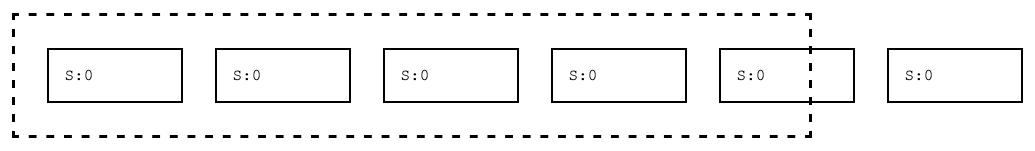
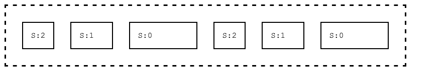
Here's some examples with flex-shrink set. The elements with S:2 have the class .fs-2, S:1 has .fs-1, and S:0 has fs-0. Each flex item has a width of 100px. In the first example, notice that none of them shrink, and they overflow the container. The container is set to no-wrap, since otherwise there would be no necessity for flex items to shrink.
.flex-container{
    flex-wrap:nowrap
}
p {
    width: 100px;
}
.fs-2 { flex-shrink: 2}
.fs-1 { flex-shrink: 1}
.fs-0 { flex-shrink: 0}
In the second example, two elements are bearing all of the "shrink", trying to allow for space for everything. There's a minimum amount of content space though, given the text - so they can't shrink enough - we still have some overflow.
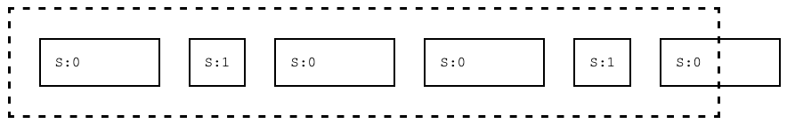
In the final example, two more elements are included for shrinking, so now with four elements able to be made smaller, all can fit. In fact, there's enough room available to leave more space available to the S:1 elements. The S:2 elements are shrinking twice as much as S:1 elements.
In both the case of flex-grow and flex-shrink, negative values are not acceptable. You can combine flex-grow and flex-shrink, but a good rule of thumb is to do so sparingly. Part of the power of flexbox is that there are so many great options to choose from - but often combining a bunch of them makes things needlessly complex. Always keep things as simple as possible!
Flex Item - Order
Ordinarily, flex items appear within the container based on the order in which they appear. This is called source order. We have the power to change this however, by specifying order property.
<div class="flex-container">
    <p style="order:5;">1</p>
    <p style="order:3;">2</p>
    <p style="order:19;">3</p>
    <p style="order:0;">4</p>
    <p style="order:9;">5</p>
    <p style="order:2;">6</p>
</div>
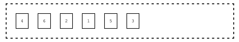
This might seem odd, what is the purpose? Why not just create the elements in the desired order within the source code? There are two common reasons we might do this:
- In dynamic lists of data, the data may have an ordering property. Using templates (pug), we may dynamically assign the
orderproperty, allowing the browser to order data items based on the ordering property, rather than requiring the pug code (or the model generation code) to sort the data first. - In responsive design, we will see we can define CSS rules based on screen size. In some situations, we may want different orderings on mobile, as opposed to desktop layouts - and by specifying order via CSS rules, we can achieve this effect.
There are truly an infinite number of layouts you can achieve with flex layout. Flex layout is best used for arranging parts of a web page, in particular when creating components. Flex layout shines when we shift to responsive design as well.
Next up, is Flexbox's younger and even more powerful sibling - CSS Grid. CSS Grid builds on Flexbox (and also works well along side it), but it provides a huge step up in terms of directly positioning components within a larger page.