Styling Text
We've learned the syntax of CSS, how and where we can write it, and how the browser decides which rules to use when rendering. Over the next few sections, we will take a broad tour of which CSS properties/attributes are available to us. We'll start with styling that is specifically about the appearance of text, wherever it is found on our pages.
Font Families
Font control the essential shape and appearance of the letters we use for text. The characters are typically called glyph, and a font defines the precise pixel geometry of each glyph in the character set. Fonts are a tricky subject, from the perspective of the web, because fonts themselves are traditionally the purview of the operating system. When your operating system is installed, it comes with collections of fonts - Ariel, Times New Roman, Verdana, Gothic, etc. Some of these fonts were developed by the operating system vendor, some are open source, some are licensed and the cost of using them is already baked into the cost of the operating system itself. They are stored on your machine in a variety of file formats, depending on the operating system. On Microsoft Windows, for example, font files are found in C:\Windows\Fonts - usually *.tff or *.otf files. They are bitmaps - meaning they are really just simple arrays of pixel data - drawing each glyph.
Why are we talking about glyphs and font files? You, as a web developer, don't know which operating system your page's visitors is using. Different operating systems come with different subsets of fonts. There's actually a surprising lack of consistency! All this is to say, when we specify fonts to be used on a web page, we need to do so carefully.
The font-family attribute describes the font to be used for a particular set of HTML elements. For example:
p {
    font-family: serif;
}
The CSS above instructs the browser to use a serif font. Serif means that the characters have those little feet and hooks, as opposed to sans serif, which is without serif.
serifsans serif
Serif and Sans Serif are not actual fonts - you won't find them on your operating system. They are classifications of fonts, and your operating system is bound to support at least one - and usually has a default option for each classification. The CSS specification takes advantage of these classifications, ans supports 5 base classes of fonts:
serifsans serif monospacecursive fantasy
As a web developer, specifying one of these classes doesn't give you total control - the web browser will render the text using the default font found within that class on the user's system. You can try to exert more control however. The font-family attribute permits you to specify a series of fonts - which the browser will use if they are available. For example:
p {
    font-family: "Edwardian Script", "French Script", cursive;
}
Some font, but not quite sure!
The browser renders in the first font available on the user's system - left to right. If your operating system supports "Edwardian Script", it will be used to render the text above, if not, maybe "French Script", and as a final fall back - it will use whatever cursive default is available.
Typically, you will always want to at least end the font-family attribute with one of the base classes - which are written unquoted. All other fonts are quoted. There are some fonts that are more commonly supported than others. The W3 School lists a few:
- Arial (sans-serif)
- Verdana (sans-serif)
- Tahoma (sans-serif)
- Trebuchet MS (sans-serif)
- Times New Roman (serif)
- Georgia (serif)
- Garamond (serif)
- Courier New (monospace)
- Brush Script MT (cursive)
Font stack is another nice resource for judging how widely supported your chosen font will be among your users. Be conservative, if you are really tied to a particular font, you might be disappointed to learn many of your uses aren't seeing what you thought they'd see!
Web Fonts
There is an alternative to the "hope for the best" font selection, and that's to have the user's browser download the font you want to use itself. Providers such as Google Fonts have thousands of fonts available, available as fonts defined in CSS. These fonts can be linked on your page. For example, here's the link element for the font face Roboto that can be placed in your HTML file. It pulls in Roboto, in a variety of weights and styles (italics).
<link href="https://fonts.googleapis.com/css2?family=Roboto:ital,wght@0,100;0,300;0,400;0,500;" rel="stylesheet">
Roboto Font Example
You may also embed your own font files, hosted on your own server. This is done by defining a font-face in your CSS, and linking it to a glyph file - woff being the most commonly used extension, which is the Web Open Font Format
@font-face {
    font-family: 'my-font';
    src: local('my-font'), url('./my-font.woff') format('woff');
}
Once the font-face has been defined, you can use the font name in any font-family CSS rule. This method tends to have better visual performance, avoiding text flicker as fonts load.
Recommendations on Fonts
If your priority is snappy page loads, especially on mobile devices, you will likely what to avoid web fonts. As long as you don't need absolute control of the exact font used, using a system font optimizes user experience. In reality, unless your font is communicating brand, it's probably OK to use a legible set of basic fonts - so opt for this first.
If you need total control over the font, then start looking at web fonts. Google Fonts and other providers allow you to explore lots of fonts, and perhaps settle on something. Before locking in, you should also explore open source fonts that you can serve directly and embed as @font-face, as this offers the next best performance aside from relying on system fonts.
Font Size
Font size is controlled using the font-size attribute, where the value can be specified in a large variety of ways:
p {
    font-size: 1em;
}
1em means the font-size is being sized proportionally to it's parent element - in this case, 1:1. Let's look at some of the different ways you can specify font sizes:
Physical Estimates
px- usingpxallows you to size the font directly, by pixel, on the user's screen. The typical default font size is 16 pixels, but this is tricky - because screens have very different pixel densities - meaning pixels can be different physical sizes depending on the device your user is viewing the page on.pt- specifying fonts in point size is a relatively old-school style of specifying fonts. Pixels are generally assumed to be about 1/96th of an inch, making 16px fonts on "standard" devices comfortable to read. The term "standard device" is problematic in today's world, makingpxproblematic too. Point sizes really suffer from the same issue, they are just different physical dimensions. 1 point is assumed to be 1/72nd of an inch (so, slightly bigger than a pixel). 16px is roughly equivalent to 12pt.cm,mm,in- use these dimensions is rarely advisable. For all the same reasonspxandptcan be problematic (screen densities), these measurements have the same challenge, plus they aren't really intuitive for graphic designers. Generally speaking, the notion of specifying elements of HTML (font or otherwise) in physical dimensions is very likely always a mistake - as you inherently cannot control the user's physical display device size, nor pixel density.
Relative Sizes
rem-1remmeans that a font (or any other element) is to be the same size relative to the root - thehtmlelement. In the context of font sizes, it means the font size of the given element should be the same as the font size defined on thehtmlelement.1.5rem,2rem,10remmean 1.5x, twice, and ten times the size of the root element.remunits are always relative to the root, making them predictable for developers. In addition, thehtmlelement's default font-size set by the web browser generally takes things such as physical display size and pixel density into account. The web browser can do this because it has access to operating system APIs that will provide it. This means thehtmlelement's default font size will generally be a very reliable guide as to a comfortable font. Sizing elements relative to it tends to produce good results across a variety of devices.em-emis very similar torem, but the sizing is relative to the parent element. Let's say apelement is sized at2em. If it is within abodythat is also sized at2em, then thepelement has four times as large of text as the defaulthtmlelmeent. In the same scheme, if bothpandbodywere set to2rem, then both would simply be twice as large.%- percentage based sizing is equivalent to usingem. 200% is equivalent to 2em. It is relative to the parent.vworvh- View width (vw) and view height (vh) are a newer and popular alternative - combining a bit of the physical dimension with the relative concept.1vwis equivalent to 1% of the device's viewable width. Note, it's the device/window - technically, the viewport. This means that the dimension will change size fluidly as the window of the browser changes on a desktop, and will expand/contract based on mobile device sizes. A font size of something like2vwis a common choice for regular text.
Size classes
You can also specify size classes, in both absolute and relative notation. By using these classes, the browse ultimately decides the specific font size used. Each size classification is roughly 20% larger than the previous.
Absolute Sizes
xx-smallx-smallsmallinitial(the default)largex-largexx-large
Relative (to the parent) Sizes
smallerlarger
Of the entire set, generally developers stick to px, em, and rem. The most recommended approach is to use em and rem, and to avoid px because a pixel on one device just simply isn't the same as a pixel on another device. Screens have varying densities - for example, mobile device pixel density is much higher than a low-cost, large desktop monitor. A font that looks adequate at a certain pixel dimension on a desktop monitor may look extremely small on a high end mobile device. Typically, browsers will calculate quality default sizes for html and body based on the device's pixel density - and if you stick to using em and rem you are always specifying sizes relative to the size the browser selected for the document itself. The difference between em and rem is simply what you are defining the font relative to. Many developers find rem to be easier to work with, because it is unaffected by parent element changes.
The Line Box
Another aspect to the physical dimensions that fonts take up on the screen is the line box. The line box controlled partially by the font, and partially by the line-height CSS property. Each text glyph occupies a cell, which has a height and width. font-size ultimately defines the height of the individual glyph, from the baseline to the top of the cell - called the em height. The font family (the actual font) defines the ratio between em height and ex height, along with baseline height - shown in the figure below. These ratios are necessarily defined by the font itself, because they are driven by the actual shape of the glyphs. For some fonts, characters like y and j dip further below the baseline than other fonts - necessitating a larger baseline height, and likewise the relationship between the height of capitalized letters and lower case letters has the same variation driven by the shape of the glyph.
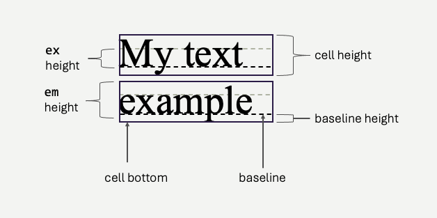
By specifying the font-size and font-family, you specify the em height, ex height, baseline height, and cell height of the text. However, cells form lines, and lines occupy vertical space on the screen. You may increase (or decrease) line height using the line-height property, typically using percentages, viewport height, or em/rem values.
.shorter {
    line-height: 50%
}
.taller {
    line-height: 200%
}
Shorter - `line-height: 50%`
In CSS, line-height controls the vertical spacing between lines of text within an element. It can be specified in units, percentages, numbers, or the keyword normal.
Normal - `line-height: 100%`
In CSS, line-height controls the vertical spacing between lines of text within an element. It can be specified in units, percentages, numbers, or the keyword normal.
Taller - `line-height: 200%`
In CSS, line-height controls the vertical spacing between lines of text within an element. It can be specified in units, percentages, numbers, or the keyword normal.
Font Style
There are three attributes used to change the actual glyphs used when rendering fonts. For some fonts, the used of these attributes actually changes the font bitmaps that are used to render the glyphs, because for many fonts, the artists create separate renderings for bold, italics, and other variations. This is, in fact, why we call the font a font family, it's a group of glyphs in most cases.
font-stylecan be set tonormal,italic, orobliquefont-weightcan be set tonormalorboldfont-variantcan be set tonormalorsmall-caps(and some others, see the MDN)
| Normal Font Style, Normal Weight, Normal Variant | Italic Font Style, Normal Weight, Normal Variant | Oblique Font Style, Normal Weight, Normal Variant |
| Normal Font Style, Bold Weight, Normal Variant | Italic Font Style, Bold Weight, Normal Variant | Oblique Font Style, Bold Weight, Normal Variant |
| Normal Font Style, Normal Weight, Small-caps Variant | Italic Font Style, Normal Weight, Small-caps Variant | Oblique Font Style, Normal Weight, Small-caps Variant |
Oblique is rarely much different from italics but there is subtle difference. Oblique actually uses the normal glyph, and transforms it to be slanted - while italics actually uses (when available) a different glyph. The difference is usually fairly small, but in some special cases, where you have very specific constraints, might be meaningful.
Pseudo-Selectors for Text
We've already covered some CSS pseudo selectors for identifying particular elements, however there a few that allow you to specify specific parts of text as well. This is different than element selectors, because individual characters in text are not often (preferably) wrapped in their own elements.
p {
    color:aqua;
}
p::first-line {
  font-weight: bold;
  text-decoration: underline;
}
p::first-letter {
    color: yellow;
}
<p>
    The ::first-line pseudo-class styles the first line of a
    block-level element, while ::first-letter styles the first
    character. Both enhance typography, supporting
    properties like font, color, or size.
</p>
The ::first-line pseudo-class styles the first line of a block-level element, while ::first-letter styles the first character. Both enhance typography, supporting properties like font, color, or size.
These selectors are particularly helpful because they react to the browser's text flow layout. When the window size changes, text reflows, and the characters belonging to the first line, for example, will change. The CSS styling will apply to the correct characters, in all cases - without any extra work on your part!
Selecting other parts of text?
As a fallback, we often use the span element to attach different styles to text without disrupting the flow of the text itself. Here, we've wrapped a specific portion of the text and colored it differently. Of course, there are also other more semantic inline HTML elements, like code, cite etc that you could use (and style) for this purpose as well.
span.special {
    color: yellow;
    font-weight: bold;
}
<p>
     The span element in HTML is an inline container used to apply styles or
     <span>manipulate</span> a specific portion of text. It doesn't inherently affect
     layout but works <span class="special">well with CSS</span> or JavaScript.
</p>
The span element in HTML is an inline container used to apply styles or manipulate a specific portion of text. It doesn't inherently affect layout but works well with CSS or JavaScript.
The Kitchen Sink
There's more we can do with text, and you should explore the MDS and other resources to learn more. With modern CSS, you can essentially do anything you need to with text!
letter-spacing: Adjusts the horizontal spacing between characters in text for improved readability or design purposes. Typical values arenormal, or a specific length (e.g., 2px, 0.1em).word-spacing: Modifies the space between words in text to enhance layout and legibility. Typical values arenormal, or a specific length (e.g., 2px, 0.1em).text-transform: Controls text capitalization, converting it to uppercase, lowercase, or title case. Common values arenone,uppercase,lowercase,capitalizetext-indent: Sets the indentation of the first line of a block of text. Usually a specific length (e.g., 2px, 0.1em).text-align: Aligns text horizontally within its container. Typical value areleft,right,center,justify,start,endtext-decoration: Adds or removes effects like underline, overline, or strike-through to text. Values includenone,underline,overline,line-through,underline overline.white-space: Controls how white space, line breaks, and wrapping are handled in text. This is useful when trying to control how a browser automatically wraps words and lines of text. Common values includenormal,nowrap,pre,pre-wrap,pre-line.
There are many others - explore!