The term positioning means to put an element in a place on the screen - usually in a place that is different from where the normal flow layout would place it. In the early days of CSS, there were three primary ways to position elements - float, absolute and fixed positioning. In this section, we'll look at all three. In many respects, they have now been at least partially superseded by modern flexbox and grid, but these three techniques still have their place - and are still the the right technique in some situations.
Float positioning is perhaps the most graceful of the positioning techniques. Ultimately, float is used when you are little less concerned about the exact positioning of an element, and instead more concerned about moving it out of the main body of content.
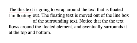
Let's see a simple example. Below is some text in a p element, with a span of text floated out to the left.
span {
    float:left;
    border: 1px solid red;
}
<p>
The this text is going to wrap around the text that is floated out.  <span>I'm floating.</span>  The floating text is moved out of the line box of the surrounding text.
</p>
This doesn't seem that useful, but we are going to add more in a moment. Before doing so though, let's make very clear what float is doing:
The float property only applies to the element it is specified on - which we will call the floated element(=). It is not really affecting the siblings, children, or parent. However, where necessary, siblings will need to move to accommodate the floated element's new position.
The floated element will always be positioned within it's parent. This means, the parent will grow / shrink to accommodate wherever a floated element needs to be.
The floated element is pulled out of the flow layout at the vertical position it normally would render, and moved to the left or right. This has important implications - for example, if there is no content below the floated element in the first place, it's quite unlikely you will see much of an effect from float!
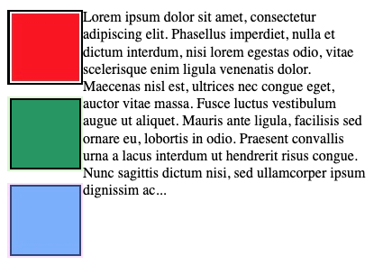
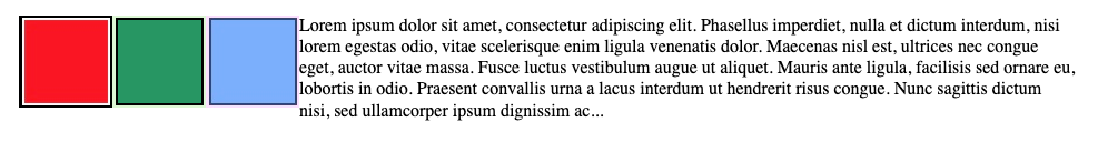
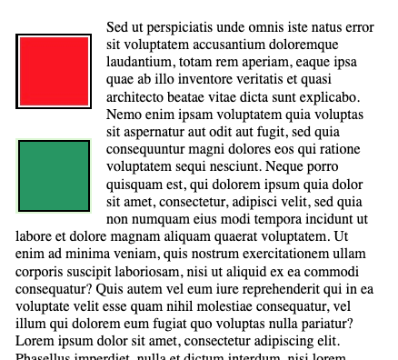
That third point trips students up, often. Let's change the example up a bit, and instead of using a span element, let's use an img element. Images have heights that don't correspond to line boxes per se, so they visually make a little more sense as floated elements than just a couple of floating words:
img {
    float:left;
}
<p>
    <img src="red-square.png" />
    Lorem ipsum dolor sit amet, consectetur adipiscing elit.
    Phasellus imperdiet, nulla et dictum interdum, nisi lorem
    egestas odio, vitae scelerisque enim ligula venenatis dolor.
    Maecenas nisl est, ultrices nec congue eget, auctor
    vitae massa. <img src="green-square.png" />Fusce luctus
    vestibulum augue ut aliquet. Mauris ante ligula, facilisis sed
    ornare eu, lobortis in odio. Praesent convallis urna a lacus
    interdum ut hendrerit risus congue. Nunc sagittis dictum nisi,
    sed ullamcorper ipsum dignissim ac...<img src="blue-square.png" />
</p>
Look closely at the rendered result - the red square's top is precisely aligned with the top of the first line box, since it was supposed to be on the first line. The green square's top is precisely aligned with the same line box as the words "massa" and "Fisce" from the lorem ipsum text, because that's the same line box it should have been in. Finally, the blue square is aligned with the last line box.
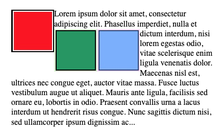
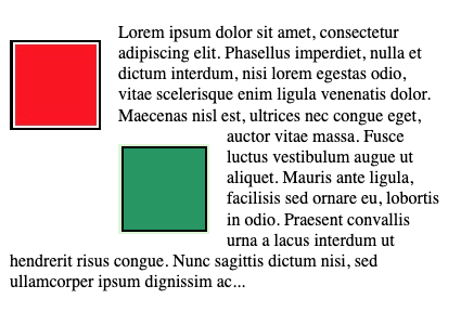
That example worked out really nicely, since the line boxes the images were appearing in were naturally vertically distant enough from each other that there was room to float the images out, and have them nicely spaced out. That was luck though. What happens when that's not the case?
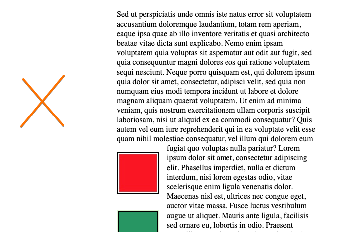
<p>
    <img src="red-square.png" />
    Lorem ipsum dolor sit amet, consectetur adipiscing elit.
    Phasellus imperdiet, nulla <img src="green-square.png" />
    et dictum interdum, <img src="blue-square.png" /> nisi lorem
    egestas odio, vitae scelerisque enim ligula venenatis dolor.
    Maecenas nisl est, ultrices nec congue eget, auctor
    vitae massa. Fusce luctus
    vestibulum augue ut aliquet. Mauris ante ligula, facilisis sed
    ornare eu, lobortis in odio. Praesent convallis urna a lacus
    interdum ut hendrerit risus congue. Nunc sagittis dictum nisi,
    sed ullamcorper ipsum dignissim ac...
</p>
In a word... yuck. float did as promised. It took each image out of it's line box, drifted it to the left, and aligned it's top with the top of the line box it came from. However, because the green and blue square's line box isn't low enough, it needed to create more room to the right of the red square. Likewise, since the blue and green squares are from the same line box, they are lined up horizontally - since their tops need to line up with the line box.
The rendering above is a fixed image, but if you had something live in your browser, you'd notice that as you changed the dimensions of the screen, text wrapping would still be occurring. If skinny enough, the squares would float out vertically separated as before. If wide enough, all three would be on the same line.
Float leaves most of the control to the browser. It's graceful in that it lets the browser do it's thing - aside from asking it to float the element out.
The rule of thumb on where things will float to:
Where is the element supposed to be?
Simply move the element out to the left or right, at the same vertical position.
Allow all the remaining content to flow around it.
Float may seem, so far, pretty limited. None of the examples look all that nice. However, there's a lot you can actually accomplish, by combining float with margins and by clearing out space above and beneath as necessary.
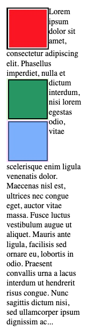
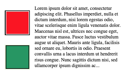
Let's take a look at another example, with just two images. We'll also add some margins to the floated elements, which is now being accomplished by assigning a class to the element, so it can apply to any type.
The result at first is confusing. There appears to be enough vertical space to have the two images right on top of each other. However, the margins we've applied prevent this - and so the second images gets pushed to the right. Usually, this isn't what we want. Getting rid of the margin-block could be an option, but we probably do want some natural spacing between the squares.
There's one way to accomplish this, and it starts us on the path of better usage of float itself - and that't the clear property. Setting an element's clear property to either left, right, or both instructs the browser to always push that element below an element floated to it's left, right, or either side. So, let's add clear:left to the left class.
The clear:left directive tells the browser to push any .left class element below elements floated to it's left. The result - a lot like what we wanted (probably)!
Float is a great way to pull content out of the main content area, and slide it left or right. The browser honors margins and padding, and allows text to flow around the elements nicely. The greatest advantage of float is that it preserve the vertical position of the floated element. This means, it will appear vertically on the page in the same location as it would have appeared if it wasn't floated. This makes float perfect for images, where the surrounding text is discussing it.
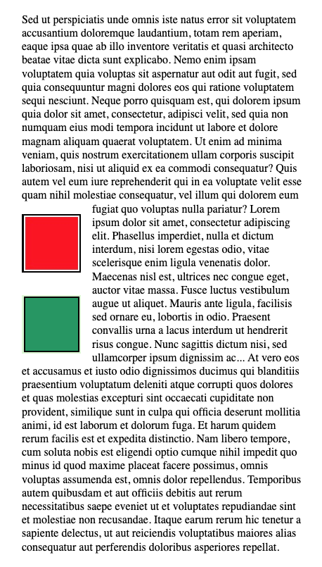
Let's try the same example now, but add some text before and after - so the floated elements are within a larger text structure.
That looks a lot like how something might appear in a textbook! With margins applied, the text naturally flows around the images without getting too crowded. But what if we wanted the images to be in a sidebar - where the text wasn't flowing around the images - but there was a nice margin to the left instead.
Well, HTML has an aside element. You may first think, let' put all the images in an aside, and float the aside. That solution can be fine - but it doesn't allow the images to be located at specific positions based on the text - which is really a big part of the value of floats. Moreover, the height of the aside will be just large enough for the images - so you haven't really created the clearing you wanted. The only solution here would be to set aside to have height:100%.
<p>
<aside class="left">
<img src="red-square.png" />
<img src="green-square.png" />
</aside>
Sed ut perspiciatis unde omnis iste natus error sit
voluptatem accusantium doloremque laudantium, totam
rem aperiam, eaque ipsa quae ab illo inventore veritatis et
quasi architecto beatae vitae dicta sunt explicabo. Nemo
enim ipsam voluptatem quia voluptas sit aspernatur aut odit
aut fugit, sed quia consequuntur magni dolores eos
qui ratione voluptatem sequi nesciunt. Neque porro
quisquam est, qui dolorem ipsum quia dolor sit amet,
consectetur, adipisci velit, sed quia non numquam
eius modi tempora incidunt ut labore et dolore
magnam aliquam quaerat voluptatem. Ut enim ad minima
veniam, quis nostrum exercitationem ullam corporis
suscipit laboriosam, nisi ut aliquid ex ea commodi
consequatur? Quis autem vel eum iure reprehenderit qui
in ea voluptate velit esse quam nihil molestiae consequatur,
vel illum qui dolorem eum fugiat quo voluptas nulla pariatur?
Lorem ipsum dolor sit amet, consectetur adipiscing elit.
Phasellus imperdiet, nulla et dictum interdum, nisi lorem
egestas odio, vitae scelerisque enim ligula venenatis dolor....
</p>
The clear isn't the right solution here either. We could wrap all the text, and assign that element to have clear-left, but then that would simply push all the text below the images.
What we really need is a true margin to the left, where the floated elements can live. Let's try that, but giving the paragraph a left margin large enough to fit the images.
.left {
    float: left;
    margin-right: 1rem;
    margin-block: 1rem;
}
p {
/* This value is based on the size of the image */
margin-left:100px;
}
Unfortunately, that doesn't work. The p element's margin is set just fine, but the elements that are floated are within the border of the p element, since the floated elements are still children of the p element.
The bottom line is this: float fully honors all element's padding and margins. You cannot have an element positioned within another element's padding, and you can't encroach on any element's margin. As we will see in a moment, the effect of having a pure margin along the entire text is achieveable, but not with float.
The other limitations with float are associated with it's strength - you aren't controlling everything. For situations that are simply, like floating an image out of text, that's a strength not a limitation. For situations where you need more control... well, that's where float becomes harder to deal with, and we'll have better solutions!
Float elements are still technically part of the flow layout. They are not technically considered positioned. Let's move on now, and start talking about really positioning elements. The first rule in positioning elements on the screen is that they are always positioned relative to something.
The position attribute controls whether or not an element is considered positioned. It has five possible values, and poorly named ones at that:
static - is the default value for the position property, and it means the element is not positioned. The element's position is simply controlled by the standard flow layout of the page. All of the elements we've used up until now have position:static, including the floated elements. There's not much to say here - more than this: static positioned elements do not play a role whatsoever in any of the other positioning mechanisms.
relative is the most misunderstood value of the five! An element whose position is relative is positioned relative to where it normally would appear in the flow layout. With just position:relative, this rule actually has no effect on the location of the element - as you haven't defined an offset from the normal location.
To modify the element's position, we can use any combination of the following. In each, the anchor is considered what we are positiioning relative to - and in the case of postion:relative, we are positioning relative to the normal location of the element. left - a CSS length, sets the left margin of the element to be the specified distance from the anchor's left margin.
right - a CSS length, sets the right margin of the element to be the specified distance from the anchor's right margin.
top - a CSS length, sets the top margin of the element to be the specified distance from the anchor's top margin.
bottom - a CSS length, sets the bottom margin of the element to be the specified distance from the anchor's bottom margin.
Note that if we specify both left and right, then width must be calculated to accommodate those specifications. If we set only left, or only right, then width will be calculated as it normally would - the content requirements. Same goes for top and bottom, if one is specified, then the height is simply dependent on the content, if both are specified, then height will be the difference betwene the two (and you may need to consider overflow).
Here's an example of a relatively positioned span, that has been shifted -10px up, and 20px to the right:
<p>
    Sed ut perspiciatis unde omnis iste natus error sit voluptatem
    accusantium doloremque laudantium, totam rem aperiam, eaque ipsa
    quae ab illo inventore veritatis et quasi architecto beatae vitae
    dicta sunt explicabo. Nemo enim ipsam voluptatem quia voluptas
    sit aspernatur aut odit aut fugit, sed quia consequuntur magni
    dolores eos qui <span class="just-relative"> ratione voluptatem </span>
    sequi nesciunt. Neque porro quisquam est, qui dolorem ipsum
    quia dolor sit amet, consectetur adipisci velit, sed quia non
    numquam eius modi tempora incidun ut labore et dolore magnam
    aliquam quaerat voluptatem. Ut enim ad minima
    <span class="up-and-right">veniam</span>, quis
    nostrum exercitationem ullam corporis suscipit laboriosam,
    nisi ut aliquid ex ea commodi consequatur? Quis autem vel
    eum iure reprehenderit qui in ea voluptate velit esse
    quam nihil molestiae consequatur, vel
    illum qui dolorem eum fugiat quo voluptas nulla pariatur?</span>
</p>
Two things of note: (1) the element that was positioned and moved up and to the right did so over other elements. We'll talk about controlling things like z-index to do this more predictably - but it's important to see that positioned elements break free of constraints associated with padding and margins. The second (2) note is that the space originally used to render the element is preserved. Content is flowing around where the element should have been.
Relative is useful unto itself, but it is a bit special, in that it can play a role when positioning other elements. Relative position, in the absence of left, right, top, or bottom has the effect of positioning the element, but not altering it's location. This is critical for our next position option - absolute positioning.
The section heading might be misleading - absolute positioning might make it sound like we can position elements "absolutely" - but that's a misnomer. Absolute positioning allows us to specify the position of an element, absolutely, relative to some parent element. The absolutely part of that sentance is actually pointing towards a big difference between this (positioned elements, not just absolute) and floating elements. We are fully specifying the position of the element - the browser isn't going to do any work for us anymore.
The name also stems from the notion that you can position relative to the body, which has the effect of positioning the element absolutely, as if not relative to anything. The name is poor.
The most important rule to understand is with absolute positioning, you are positioning the element relative to the nearest ancestor that is also positioned. An element is positioned if it's position value is not static. That means, an element can be the anchor of an element with absolute position if it meets the following conditions:
It is an ancestor of the element to be absolutely positioned.
It has position either relative, absolute, fixed, or sticky.
Let's take a look at a simple example, with the same paragraph as before:
p {
    /* We set p to relative so it's an anchor to the span
       elements that are absolutely positioned. If we
       didn't, the spans would be positioed relative
       to the entire page */
    position: relative;
}
span {
    background-color: yellow;
}
.down-and-right {
    position: absolute;
    top: 10px;
    left: 20px;
    border: 1px solid blue;
}
.more {
    position: absolute;
    top: 50px;
    left: 75px;
    border: 1px solid blue;
}
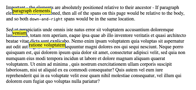
<p>
    Important - the elements are absolutely positioned relative
    to their ancestor - <span class="down-and-right">paragraph
    elements. </span> If paragraph elements weren't positioned,
    then all of the spans on this page would be relative to the body,
    and so both <code>down-and-right</code> spans would be in the same
    location.
</p>
<p>
    Sed ut perspiciatis unde omnis iste natus error sit voluptatem
    accusantium doloremque laudantium, totam rem aperiam, eaque ipsa
    quae ab illo inventore veritatis et quasi architecto beatae vitae
    dicta sunt explicabo. Nemo enim ipsam voluptatem quia voluptas
    sit aspernatur aut odit aut fugit, sed quia consequuntur magni
    dolores eos qui <span class="more"> ratione voluptatem </span>
    sequi nesciunt. Neque porro quisquam est, qui dolorem ipsum
    quia dolor sit amet, consectetur adipisci velit, sed quia non
    numquam eius modi tempora incidun ut labore et dolore magnam
    aliquam quaerat voluptatem. Ut enim ad minima
    <span class="down-and-right">veniam</span>, quis
    nostrum exercitationem ullam corporis suscipit laboriosam,
    nisi ut aliquid ex ea commodi consequatur? Quis autem vel
    eum iure reprehenderit qui in ea voluptate velit esse
    quam nihil molestiae consequatur, vel
    illum qui dolorem eum fugiat quo voluptas nulla pariatur?</span>
</p>
Important - elements that are absolutely positioned also cede their position within the normal flow layout. Unlike relative elements, there is no gap and spacing left within the original content. Ultimately, this inconsistency works well for developers - because often relative positioned elements simply serve as anchors, and not leaving a gap for them would cause lots of complications. It's one of those situations where the inconsistency feels odd, but in practice it does make sense.
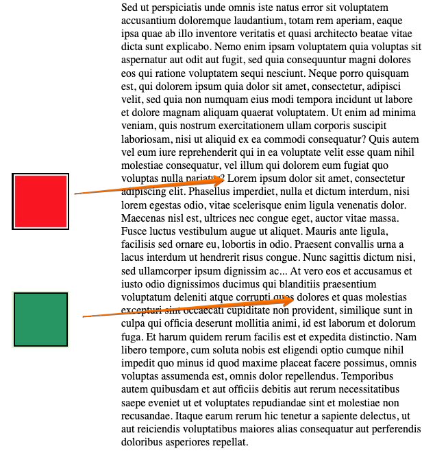
Armed with this new tool, let's revisit the text from the float section, and see if we can get our side bar to work. Recall, the goal was to have a left hand margin along the text with plenty of space for images. We wanted the images to appear in the same vertical position as they would normally. We can accomplish this by using absolute, and setting the parent's padding.
<p>
    Sed ut perspiciatis unde omnis iste natus error sit voluptatem
    accusantium doloremque laudantium, totam rem aperiam, eaque ipsa
    quae ab illo inventore veritatis et quasi architecto beatae vitae
    dicta sunt explicabo. Nemo enim ipsam voluptatem quia voluptas
    sit aspernatur aut odit aut fugit, sed quia consequuntur magni dolores eos qui
    ratione voluptatem sequi nesciunt. Neque porro quisquam est,
    qui dolorem ipsum quia dolor sit amet, consectetur, adipisci velit,
    sed quia non numquam eius modi tempora incidunt ut labore et dolore
    magnam aliquam quaerat voluptatem. Ut enim ad minima veniam, quis nostrum
    exercitationem ullam corporis suscipit laboriosam, nisi ut aliquid ex ea commodi
    consequatur? Quis autem vel eum iure reprehenderit qui in ea voluptate
    velit esse quam nihil molestiae consequatur, vel illum qui
    dolorem eum fugiat quo voluptas nulla pariatur?
    <img class="note" src="red-square.jpg" />
    Lorem ipsum dolor sit amet, consectetur adipiscing elit. Phasellus
    imperdiet, nulla et dictum interdum, nisi lorem egestas odio,
    vitae scelerisque enim ligula venenatis dolor. Maecenas nisl est,
    ultrices nec congue eget, auctor vitae massa.
    Fusce luctus vestibulum augue ut aliquet. Mauris ante ligula, facilisis sed ornare
    eu, lobortis in odio. Praesent convallis urna a lacus interdum ut hendrerit risus
    congue. Nunc sagittis dictum nisi, sed ullamcorper ipsum dignissim ac...
    At vero eos et accusamus et iusto odio dignissimos ducimus qui
    blanditiis praesentium voluptatum deleniti atque corrupti
    quos <img class="note" src="green-square.png" />
    dolores et quas molestias excepturi sint occaecati cupiditate
    non provident, similique sunt in culpa qui officia deserunt mollitia animi,
    id est laborum et dolorum fuga. Et harum quidem rerum facilis est et expedita
    distinctio. Nam libero tempore, cum soluta nobis est eligendi optio
    cumque nihil impedit quo minus id quod maxime placeat facere
    possimus, omnis voluptas assumenda est, omnis dolor repellendus.
    Temporibus autem quibusdam et aut officiis debitis aut
    rerum necessitatibus saepe eveniet ut et voluptates repudiandae
    sint et molestiae non recusandae. Itaque earum rerum hic tenetur a
    sapiente delectus, ut aut reiciendis voluptatibus maiores alias
    consequatur aut perferendis doloribus asperiores repellat.
</p>
Notice something important - the vertical placement of the absolute positioned element corresponds to where they normally would be in the flow layout! This is because we specified neithertop nor bottom. The horizontal placement corresponds to 0px from the edge of the left margin of the parent p element (since p is positioned). Since absolute positioning allows you to place elements that encroach on other elements margin and padding, there is no problem placing the images in that empty space created by the padding we put on the p element. The padding-left on the p element is critical here - it's what is creating the space. Note, we could have also used margin, but then we'd need to set the left value to be a negative value, to move it to the left of the left edge of the paragraphs content area.
/* with unaltered HTML, this CSS has the same effect,
   the note must be positioned offset to the left of
   the p element now, since the p element is using margin
   instead of padding to create the space on the left side.
*/
p {
    position: relative;
    margin-left: 10em;
}
.note {
    position: absolute;
    left: -10em;
}
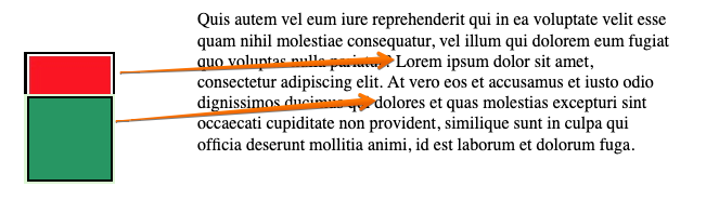
Recall however, with cotnrol comes a cost. When using absolute, we don't get any help from the browser. Well, what are we missing?
Here's a demonstration - using the same CSS, but with different HTML content.
<p>
    Quis autem vel eum iure reprehenderit qui in ea voluptate
    velit esse quam nihil molestiae consequatur, vel illum qui
    dolorem eum fugiat quo voluptas nulla pariatur?
    <img class="note" src="red-square.jpg" />
    Lorem ipsum dolor sit amet, consectetur adipiscing elit.
    At vero eos et accusamus et iusto odio dignissimos ducimus qui
    <img class="note" src="green-square.png" />
    dolores et quas molestias excepturi sint occaecati cupiditate
    non provident, similique sunt in culpa qui officia deserunt mollitia animi,
    id est laborum et dolorum fuga.
</p>
Well, this is a problem! When things are absolutely positioned, the browser makes no attempt to make sure they don't overlap! This is the very nature of absolute positioning however. Ultimately, if you need to ensure this doesn't happen, and you don't have any control over the relative sizes of the content, the things positioned, etc, then you might end up needing client side JavaScript (and honestly, you probably should consider a simpler layout).
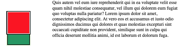
Now is a good time to talk about z-index, since our last example had very clearly overlapping images. Then things get rendered to the same location in the browser, we can use the z-index (think of the z-axis as extending out of the screen, towards you) to control what goes "on top". A larger z-index value will always appear over the top of an element with a lower number. z-index values are typically integers, and they can be positive or negative.
<p>
    Quis autem vel eum iure reprehenderit qui in ea voluptate
    velit esse quam nihil molestiae consequatur, vel illum qui
    dolorem eum fugiat quo voluptas nulla pariatur?
    <img class="note" style='z-index:1' src="red-square.jpg" />
    Lorem ipsum dolor sit amet, consectetur adipiscing elit.
    At vero eos et accusamus et iusto odio dignissimos ducimus qui
    <img class="note" style='z-index:0' src="green-square.png" />
    dolores et quas molestias excepturi sint occaecati cupiditate
    non provident, similique sunt in culpa qui officia deserunt mollitia animi,
    id est laborum et dolorum fuga.
</p>
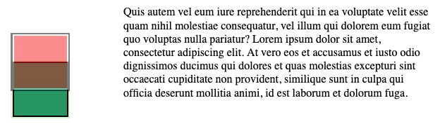
We can also control the opacity, or transparency of an element. This can be helpful when we know (and plan for) overlap. Here', let's add opacity: 50% to the red-square, meaning it is 50% transparent.
Note that the entire element (entire red sqare image) is 50% transparent, so it appears lightened on top - allowing the white background to show through. If you need to make only part of an element transparent, you need to get much more sophisticated. CSS does include things like linear-gradient and masking, but these things are beyond our scope here - and not really commonly used.
Ultimately, absolute positioning is a powerful tool - but comes with a cost. When using absolute positioning, we take a lot of responsibility for how things end up getting laid out, and that can be difficult - especially when we consider screen sizes, density, and window resizing. Use absolute position with care!
The position fixed attribute works very similarly to absolute, but solves a different type of problem. Let's say, for example, you want a navigation bar to always be pinned to the top of the screen. You want content to scroll as normal, but you want the navigation bar to always stay at the top. This is easy enough to do with absolute positioning.
The nav element is positioned to sit at the top of the screen. It's full width, since it's left and right are set to match the left and right of the body element (we aren't setting any other elements to be positioned). We've set a height of 50px, and set a bodypadding of 55px. This is important, because it prevents any other content in the body from being obscured by the nav.
<body>
    <nav>This is a navbar</nav>
    <p> Quis autem vel eum iure reprehenderit qui in ea voluptate
    velit esse quam nihil molestiae.....
    </p>
</body>
Sed ut perspiciatis unde omnis iste natus error sit voluptatem
accusantium doloremque laudantium, totam rem aperiam, eaque ipsa
quae ab illo inventore veritatis et quasi architecto beatae vitae
dicta sunt explicabo. Nemo enim ipsam voluptatem quia voluptas
sit aspernatur aut odit aut fugit, sed quia consequuntur magni dolores eos qui
ratione voluptatem sequi nesciunt. Neque porro quisquam est,
qui dolorem ipsum quia dolor sit amet, consectetur, adipisci velit,
sed quia non numquam eius modi tempora incidunt ut labore et dolore
magnam aliquam quaerat voluptatem. Ut enim ad minima veniam, quis nostrum
exercitationem ullam corporis suscipit laboriosam, nisi ut aliquid ex ea commodi
consequatur? Quis autem vel eum iure reprehenderit qui in ea voluptate
velit esse quam nihil molestiae consequatur, vel illum qui
dolorem eum fugiat quo voluptas nulla pariatur?
Lorem ipsum dolor sit amet, consectetur adipiscing elit. Phasellus
imperdiet, nulla et dictum interdum, nisi lorem egestas odio,
vitae scelerisque enim ligula venenatis dolor. Maecenas nisl est,
ultrices nec congue eget, auctor vitae massa.
Fusce luctus vestibulum augue ut aliquet. Mauris ante ligula, facilisis sed ornare
eu, lobortis in odio. Praesent convallis urna a lacus interdum ut hendrerit risus
congue. Nunc sagittis dictum nisi, sed ullamcorper ipsum dignissim ac...
At vero eos et accusamus et iusto odio dignissimos ducimus qui
blanditiis praesentium voluptatum deleniti atque corrupti
quos
dolores et quas molestias excepturi sint occaecati cupiditate
non provident, similique sunt in culpa qui officia deserunt mollitia animi,
id est laborum et dolorum fuga. Et harum quidem rerum facilis est et expedita
distinctio. Nam libero tempore, cum soluta nobis est eligendi optio
cumque nihil impedit quo minus id quod maxime placeat facere
possimus, omnis voluptas assumenda est, omnis dolor repellendus.
Temporibus autem quibusdam et aut officiis debitis aut
rerum necessitatibus saepe eveniet ut et voluptates repudiandae
sint et molestiae non recusandae. Itaque earum rerum hic tenetur a
sapiente delectus, ut aut reiciendis voluptatibus maiores alias
consequatur aut perferendis doloribus asperiores repellat.
Give it a try, scroll a bit.
It doesn't work, and that's because the top of 0px set as the position of the nav element is relative to the body, and the body is moving as you scroll. 0px relative to the body means it's up above the viewable area when you scroll down.
Intuitive, it may have felt to you that it would work, and fortunately, the concept works - but we need a small fix. The position attribute we are looking for is fixed. fixed tells the browser to compute the position of the element not relative to another element, but instead the viewable area - better known as the viewport. Fixed is a little newer than absolute, and if you search the internet you will find old solutions that use JavaScript to capture the scroll position, and compute new offsets as the user scrolls. Don't do this, fixed is the right solution, and works in all browsers.
By the way, you can also use fixed to fix things to the bottom, left, and right of the viewport - which is especially helpful for the footers to web pages.
Sed ut perspiciatis unde omnis iste natus error sit voluptatem
accusantium doloremque laudantium, totam rem aperiam, eaque ipsa
quae ab illo inventore veritatis et quasi architecto beatae vitae
dicta sunt explicabo. Nemo enim ipsam voluptatem quia voluptas
sit aspernatur aut odit aut fugit, sed quia consequuntur magni dolores eos qui
ratione voluptatem sequi nesciunt. Neque porro quisquam est,
qui dolorem ipsum quia dolor sit amet, consectetur, adipisci velit,
sed quia non numquam eius modi tempora incidunt ut labore et dolore
magnam aliquam quaerat voluptatem. Ut enim ad minima veniam, quis nostrum
exercitationem ullam corporis suscipit laboriosam, nisi ut aliquid ex ea commodi
consequatur? Quis autem vel eum iure reprehenderit qui in ea voluptate
velit esse quam nihil molestiae consequatur, vel illum qui
dolorem eum fugiat quo voluptas nulla pariatur?
Lorem ipsum dolor sit amet, consectetur adipiscing elit. Phasellus
imperdiet, nulla et dictum interdum, nisi lorem egestas odio,
vitae scelerisque enim ligula venenatis dolor. Maecenas nisl est,
ultrices nec congue eget, auctor vitae massa.
Fusce luctus vestibulum augue ut aliquet. Mauris ante ligula, facilisis sed ornare
eu, lobortis in odio. Praesent convallis urna a lacus interdum ut hendrerit risus
congue. Nunc sagittis dictum nisi, sed ullamcorper ipsum dignissim ac...
At vero eos et accusamus et iusto odio dignissimos ducimus qui
blanditiis praesentium voluptatum deleniti atque corrupti
quos
dolores et quas molestias excepturi sint occaecati cupiditate
non provident, similique sunt in culpa qui officia deserunt mollitia animi,
id est laborum et dolorum fuga. Et harum quidem rerum facilis est et expedita
distinctio. Nam libero tempore, cum soluta nobis est eligendi optio
cumque nihil impedit quo minus id quod maxime placeat facere
possimus, omnis voluptas assumenda est, omnis dolor repellendus.
Temporibus autem quibusdam et aut officiis debitis aut
rerum necessitatibus saepe eveniet ut et voluptates repudiandae
sint et molestiae non recusandae. Itaque earum rerum hic tenetur a
sapiente delectus, ut aut reiciendis voluptatibus maiores alias
consequatur aut perferendis doloribus asperiores repellat.
By the way, if you are looking at the HTML of the demo above, you'll see I didn't actually use fixed. That's because I wanted it to be embedded within the page and text. The demo has the same effect, but it's using absolute, since the nav is actually being pinned to the element.
Finally, we arrive at the newest form of positioning - sticky. Sticky creates a really popular and slick effect of keeping certain elements always on the screen, without changing the layout unless necessary.
Assume you have a long text, with a particular highlighted portion in the first paragraph. As the user scrolls, you don't want them to lose sight of the highlighted position. As the paragraph scrolls above the viewport, you would like the highlighted area to stay on the screen - perhaps stuck to the top left side. If the user scrolls back up, you'd like the highlighted text to move right back into the paragraphs.
Here's how you do it:
p {
    position: relative;
    height: 300px;
    overflow: auto;
}
.sticky {
    v
}
<p>
    Sed ut perspiciatis unde omnis iste natus error sit voluptatem
    accusantium doloremque laudantium, totam rem aperiam, eaque ipsa
    quae ab illo inventore veritatis et quasi architecto beatae vitae
    dicta sunt explicabo. Nemo enim ipsam voluptatem quia voluptas
    sit aspernatur aut odit aut fugit, sed quia consequuntur magni dolores eos qui
    ratione voluptatem sequi nesciunt. Neque porro quisquam est,
    qui dolorem ipsum quia dolor sit amet, consectetur, adipisci velit,
    sed quia non numquam eius modi tempora incidunt ut labore et dolore
    magnam aliquam quaerat voluptatem. <span class="sticky">Ut enim</span> ad
    minima veniam, quis nostrum exercitationem ullam corporis
    suscipit laboriosam, nisi ut aliquid ex ea commodi
    consequatur? Quis autem vel eum iure reprehenderit qui in ea voluptate
    velit esse quam nihil molestiae consequatur, vel illum qui
    dolorem eum fugiat quo voluptas nulla pariatur?
    Lorem ipsum dolor sit amet, consectetur adipiscing elit. Phasellus
    imperdiet, nulla et dictum interdum, nisi lorem egestas odio,
    vitae scelerisque enim ligula venenatis dolor. Maecenas nisl est,
    ultrices nec congue eget, auctor vitae massa.
    Fusce luctus vestibulum augue ut aliquet. Mauris ante ligula, facilisis sed ornare
    eu, lobortis in odio. Praesent convallis urna a lacus interdum ut hendrerit risus
    congue. Nunc sagittis dictum nisi, sed ullamcorper ipsum dignissim ac...
    At vero eos et accusamus et iusto odio dignissimos ducimus qui
    blanditiis praesentium voluptatum deleniti atque corrupti
    quos dolores et quas molestias excepturi sint occaecati cupiditate
    non provident, similique sunt in culpa qui officia deserunt mollitia animi,
    id est laborum et dolorum fuga. Et harum quidem rerum facilis est et expedita
    distinctio. Nam libero tempore, cum soluta nobis est eligendi optio
    cumque nihil impedit quo minus id quod maxime placeat facere
    possimus, omnis voluptas assumenda est, omnis dolor repellendus.
    Temporibus autem quibusdam et aut officiis debitis aut
    rerum necessitatibus saepe eveniet ut et voluptates repudiandae
    sint et molestiae non recusandae. Itaque earum rerum hic tenetur a
    sapiente delectus, ut aut reiciendis voluptatibus maiores alias
    consequatur aut perferendis doloribus asperiores repellat.
</p>
Sed ut perspiciatis unde omnis iste natus error sit voluptatem
accusantium doloremque laudantium, totam rem aperiam, eaque ipsa
quae ab illo inventore veritatis et quasi architecto beatae vitae
dicta sunt explicabo. Nemo enim ipsam voluptatem quia voluptas
sit aspernatur aut odit aut fugit, sed quia consequuntur magni dolores eos qui
ratione voluptatem sequi nesciunt. Neque porro quisquam est,
qui dolorem ipsum quia dolor sit amet, consectetur, adipisci velit,
sed quia non numquam eius modi tempora incidunt ut labore et dolore
magnam aliquam quaerat voluptatem. Ut enim ad
minima veniam, quis nostrum exercitationem ullam corporis
suscipit laboriosam, nisi ut aliquid ex ea commodi
consequatur? Quis autem vel eum iure reprehenderit qui in ea voluptate
velit esse quam nihil molestiae consequatur, vel illum qui
dolorem eum fugiat quo voluptas nulla pariatur?
Lorem ipsum dolor sit amet, consectetur adipiscing elit. Phasellus
imperdiet, nulla et dictum interdum, nisi lorem egestas odio,
vitae scelerisque enim ligula venenatis dolor. Maecenas nisl est,
ultrices nec congue eget, auctor vitae massa.
Fusce luctus vestibulum augue ut aliquet. Mauris ante ligula, facilisis sed ornare
eu, lobortis in odio. Praesent convallis urna a lacus interdum ut hendrerit risus
congue. Nunc sagittis dictum nisi, sed ullamcorper ipsum dignissim ac...
At vero eos et accusamus et iusto odio dignissimos ducimus qui
blanditiis praesentium voluptatum deleniti atque corrupti
quos dolores et quas molestias excepturi sint occaecati cupiditate
non provident, similique sunt in culpa qui officia deserunt mollitia animi,
id est laborum et dolorum fuga. Et harum quidem rerum facilis est et expedita
distinctio. Nam libero tempore, cum soluta nobis est eligendi optio
cumque nihil impedit quo minus id quod maxime placeat facere
possimus, omnis voluptas assumenda est, omnis dolor repellendus.
Temporibus autem quibusdam et aut officiis debitis aut
rerum necessitatibus saepe eveniet ut et voluptates repudiandae
sint et molestiae non recusandae. Itaque earum rerum hic tenetur a
sapiente delectus, ut aut reiciendis voluptatibus maiores alias
consequatur aut perferendis doloribus asperiores repellat.
Sticky is a very common UI pattern for navigation bars and page leads. It's an example of how fast CSS has begun to move as well. I'd compare this to box shadows and rounded corners - where for the better part of 10 years developers expended countless resources implementing the effects themselves (poorly). Modern CSS adapts to developer needs faster. When the sticky heading and footing styles became popular, the sticky positioning was added to CSS much more quickly!
You can get a long way with flow layout, float, and occasional positioning. Until 2012, these positioning methods were the only ones that developers had to create layouts. As we will discuss in the next chapter, the need for better layout methods actually drove the adoption of CSS frameworks like Bootstrap. Complex, yet extremely practical and helpful layouts like grids are achievable with the positioning techniques described in this section, but the are difficult, and really difficult to get right for all screen sizes, densities, and window sizes.
Thankfully, in 2012 the CSS standards organization began development on flexbox. Flexbox became widely adopted in 2016, and was a giant leap forward in helping developers create grids and other practical layouts that flow layout struggles with.